Addressing browse abandonment is a missed opportunity to generate sales that often goes unnoticed. It’s when you send a message to visitors who exit your site after browsing through your products.
Website abandonment can occur because of unclear navigation or insufficient information. Other factors, like visitors’ personal reasons, may also contribute to it.
But there’s hope—people who abandoned browsing your site are still potential buyers. It is possible to re-engage them and recover lost sales. One effective method is sending targeted emails based on their browsing behavior.
If you’re unsure where to start, this article covers great tips to get you started. Moreover, we’ll discuss eight real browse abandonment email examples for inspiration.
Let’s get started.
Crafting your browse abandonment email strategy
Effective email marketing requires careful planning and strategy. What should you know before sending browse abandonment emails?
Timing and frequency
One important factor in determining if someone will open your email is timing. Getting the email timing right can help you boost your email engagement rates.
This involves sending emails when recipients are most likely to engage with them.
Another important factor is the frequency at which you send these emails.
The best strategy is to create a well-structured browse abandonment flow considering both these factors.
Key components of this email automation include:
- Initial email: Send an email promptly after the browsing session. This captures the recipient’s interest while the products are fresh in their mind. Let’s say one hour after it was triggered.
- Follow-up emails: Schedule additional promotions based on user activity. Let’s say a customer spends some time browsing your sneakers collection. You could send them personalized recommendations for sneakers based on their browsing history. For example, 24 hours after the browse abandonment.
- Final email: If a user hasn’t taken the desired action, send a final incentive to prompt a response. This could be a discount or any other promotional offer. It can be sent 48 hours after the browse abandonment.
That said, it’s essential to avoid bombarding recipients with excessive emails. However, sending too few can risk your brand fading from memory.
Here are some tips for finding the best email timing and frequency:
- Understand your audience’s preferences, behaviors, and time zones
- Experiment with various send times and frequencies
- Track open rates, click-through rates, and unsubscribes
- Ask subscribers for feedback on email timing
- Take into account seasonal trends, holidays, and special events
Experiment with various timings and sending frequencies to see what works for your audience.
Segmentation and personalization
Segmentation entails categorizing your site visitors based on their browsing behaviors. You could, for example, separate visitors who viewed products from those who browsed blog articles. Another option is segmenting based on their level of engagement.
Audience segmentation helps you create personalized emails that resonate with the recipients. These emails foster real engagement rather than delivering generic messages.
For instance, you could offer frequent visitors limited-time offers on their favorite products. Conversely, first-time visitors would likely enjoy a discount or free shipping.
Segmentation ensures that recipients receive deals and offers of real value to them rather than simply mass-forwarding the same email to everyone.
Moreover, remember to personalize emails to enhance engagement further. Here are some suggestions:
- Address recipients by their names in the subject lines
- Incorporate personal pronouns like “you” and “your”
- Provide tailored product suggestions based on their browsing history
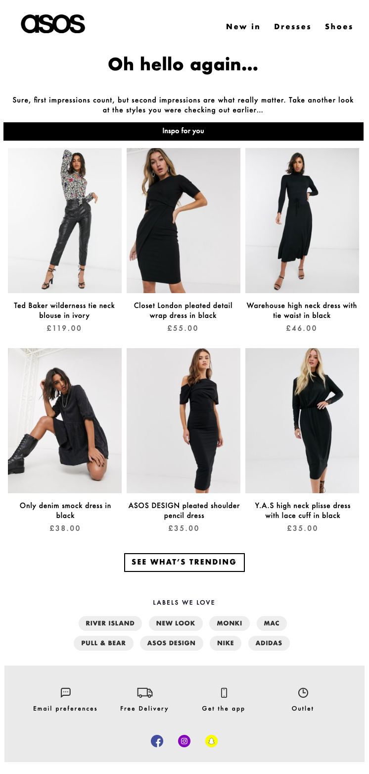
Overall, segmentation and personalization help you drive higher conversion rates. See an example from ASOS below.
 Source: Asos.com
Eight best browse abandonment examples
Below are eight browse abandonment email examples to effectively re-engage potential shoppers. Each example demonstrates unique strategies and approaches to crafting compelling emails.
1. Pulp & Press
One of the best browse abandonment examples comes from Pulp & Press, a beverage company specializing in cold-pressed juices. The email contains all the important elements without unnecessary distractions.
Additionally, the ample white space in the email significantly improves its readability.
The copy maintains a concise, clear, and compelling tone throughout. It reinforces the product’s quality with statements like “We don’t blame you. It’s a fan favorite.”
A clear CTA prompts the recipients to purchase the product they were browsing. The email also contains personalized product recommendations to pique the recipients’ interest.
Lastly, the brand invites the recipients to its loyalty program and mentions the key benefits of doing so.
 Image via ReallyGoodEmails
2. Yellowbird Sauce
The best browse abandonment email examples effectively showcase a brand’s voice.
Yellowbird Sauce, for instance, is known for its fun, sassy, and playful vibe. The bright yellow color used in this browse abandonment email reinforces its unique brand identity. Also, check out how quirky and catchy the fonts and design elements are.
The email cleverly taps into the recipient’s desire for flavor and spice. This is followed by a direct link to purchase the product they were browsing.
Additionally, for recipients seeking added value, there’s a link to combo packs. The email strategically mentions at the top that the brand offers free shipping, which further encourages purchases.
 Image via ReallyGoodEmails
3. Louie Spence
One of the most effective ways to get people interested in your products to buy them is to offer a discount. Louie Spence, a renowned dancer, uses this tactic in the email below.
He offers recipients who were browsing his upcoming masterclass an exclusive offer. They can get a 20% discount with a simple checkout code.
The email is pretty straightforward. It gives a clear overview of available classes, dates, and times. Individual CTA buttons accompany each one.
Furthermore, the email engages visitors who may be hesitant or have questions with a “Got a question?” CTA.
 Image via ReallyGoodEmails
4. Rareform
It’s tempting to immediately push for a purchase when someone shows interest in a product.
However, simply visiting a page doesn’t always indicate a buying intent. Shoppers may need time to consider their options.
Understanding this, Rareform takes a subtle approach with browse abandoners. The email below gently prompts recipients to revisit the products they viewed. It then educates them about their unique process of crafting bags from billboard waste.
Many of Rareform’s visitors are likely eco-conscious consumers, so, this information gives them a good reason to buy.
 Image via ReallyGoodEmails
5. Something Navy
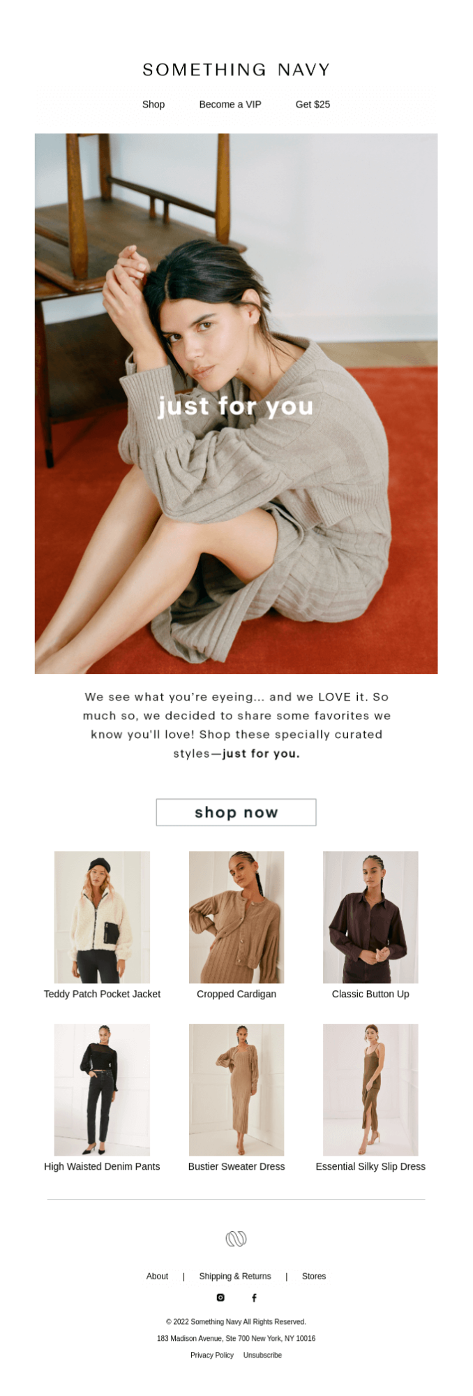
When composing a behavioral email, try to be insightful without being invasive. This is especially true when leveraging subscriber data to drive sales. Something Navy strikes this balance in its browse abandonment email, shown below.
Website visitors often depart because the decision-making process becomes overwhelming. This is particularly common in clothing and accessory shopping.
Something Navy tackles this by sharing a curated list of styles with recipients. There are six different options, each with accompanying images. This makes shopping easier for the recipient, potentially boosting sales.
 Image via ReallyGoodEmails
6. Sonos
Browse abandonment emails are often designed to address potential customer concerns. Sonos accomplishes this well in the example below.
Firstly, the email features an image of a product, with a direct purchase link. However, with a price tag of about $400, recipients may hesitate to buy.
To alleviate this concern, Sonos provides several incentives. Free shipping is offered on all orders, along with a convenient buy now, pay later option. It also provides an option to return the product within 45 days if they’re unsatisfied.
Furthermore, there are clear instructions on how to reach customer support. Notably, Sonos emphasizes its commitment to sustainability towards the end to engage eco-conscious consumers.
 Image via ReallyGoodEmails
7. National Mattress Outlet
The best browse abandonment email examples often create a sense of urgency to encourage users to take action. National Mattress Outlet does exactly that in its email.
The brand gives recipients several incentives to buy its mattresses. Firstly, the phrase “things move around quickly here” creates a sense of urgency. It shows that the product is popular and may soon go out of stock.
Secondly, free shipping is offered on orders exceeding $199. Lastly, customers can explore various coupons to maximize value.
Another noteworthy aspect is that the email addresses the recipient by name. It makes the email feel tailored specifically to the individual, increasing the likelihood of engagement.
 Image via ReallyGoodEmails
8. Whisky Loot
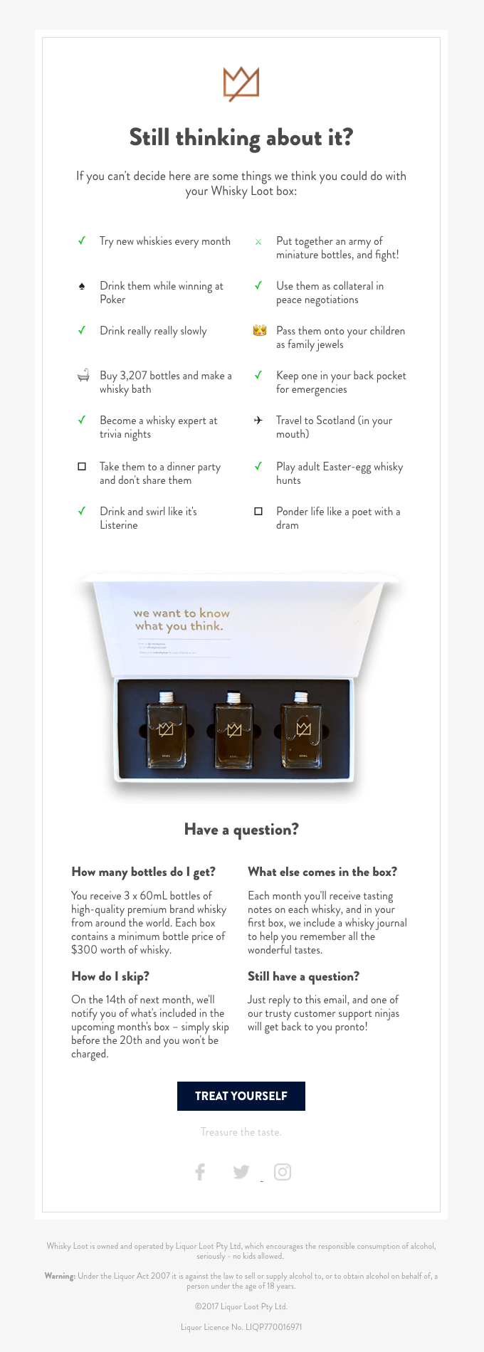
Wrapping up our lineup of browse abandonment email examples is Whisky Loot. This brand cleverly leverages humor to engage email recipients.
In the email below, the highlighted product is the Whisky Loot box, featuring three whisky bottles. The email presents a lengthy list of practical and playful uses for the product. These underscore the product’s value and appeal.
Additionally, there’s a mini-FAQ section to address user queries. The CTA in this email, “treat yourself,” is especially effective. This is because it strikes an emotional chord with recipients.
 Image via ReallyGoodEmails
Best practices for browsing abandonment emails
The examples above offer inspiration for crafting compelling email copy and content. Now, let’s look at a couple of best practices for making your browse abandonment emails more engaging.
Write clear and compelling subject lines
Your subject line gives the recipients a glimpse into your email content. That’s why you should create attention-grabbing subject lines that preview the value within.
This will help you improve email open rates, ultimately increasing campaign ROI.
Here are some tips to craft compelling subject lines for browse abandonment emails:
- Personalize the subject line with the recipient’s name
- Use urgency or time-sensitive language to prompt immediate action
- Highlight the value or benefits of revisiting the abandoned items
- Include an enticing offer or discount to incentivize engagement
- Keep the subject line concise and to the point
- Use curiosity or intrigue to pique the recipient’s interest
Most importantly, use A/B testing to measure the effectiveness of different subject lines. This will help you optimize performance over time.
Focus on mobile optimization
An increasing number of users now read emails on their smartphones and tablets. That’s why your browse abandonment emails must be optimized for mobile devices.
With mobile optimization, emails adapt to various screen sizes. This ensures that content is displayed correctly and is easy to read on smaller screens.
Here are some mobile optimization tips to get you started:
- Keep email layouts clean and concise to render well on smaller screens
- Use larger fonts and sufficient white space for improved readability on mobile
- Ensure buttons and links are easily tappable
- Optimize image sizes for quick loading times on mobile devices
- Consider adopting single-column layouts for better mobile viewing
- Continuously monitor and analyze email performance on mobile for optimization
Wrap up
As an online store owner, you can’t provide in-person assistance with purchases. However, you can engage customers by sending reminders and offering incentives through email.
Browse abandonment emails allow you to reconnect with customers with strong purchase intent. You can use these to remind them of your brand and encourage them to return to your store.
Crafting these emails doesn’t have a rigid formula for success. Hopefully, the eight browse abandonment email examples above will serve as inspiration.
If done right, this email strategy can recover lost opportunities and boost your revenue.
