Transactional emails are the most common type of emails that brands send to their customers and prospects. But just because these emails contain mundane information or updates, doesn’t mean they have to be boring.
In fact, with the right inspiration, you can design engaging transactional emails for your business.
In this post, we’ll take you through some of the best transactional email examples to inspire your email marketing. As an added benefit, you’ll also find some best practices for designing the perfect transactional emails.
Let’s get started.
What is a transactional email?
A transactional email is one that’s sent to a person who either made a purchase or had an interaction with a brand in some way or another. The main function of transactional email is to provide customers with important information they have to know.
For example, order confirmation email for a recent purchase, shipping confirmation, payment confirmation, etc.
Transactional emails are typically triggered by an action and sent automatically.
Types of transactional emails
Here are some of the common types of transactional emails.
Registration/welcome emails: These transactional emails are sent when someone signs up for something.
Notification emails: These are types of transactional emails that are used to provide updates to customers on important things, such as recent account activity or upcoming deadlines.
Feedback emails: These transactional emails are used to collect customer feedback, usually related to a recent purchase or experience.
Cart abandonment emails: These are targeted emails aimed at getting prospects who abandoned their carts to complete their purchase. The nature of these emails is more promotional than transactional. Unlike other transactional emails, you need customer consent to send cart abandonment emails.
Confirmation emails: These emails update customers on order-related updates, such as order confirmation, shipping confirmation, etc.
Best practices to follow when sending transactional emails
Here are 12 of the most effective transactional email best practices you should follow to get the best results from your emails.
1. Use a recognizable email address
Use simple and branded email addresses that people can immediately associate with your brand. Make it easy for your customers to spot your transactional emails in their inboxes.
Using different email addresses for different types of emails is also a good idea. For example, an email from “orders@brandname.com” clearly denotes that it’s a transactional email related to a recent purchase.
2. Write clear subject lines and preview text
Write your subject lines and preview text in a way that makes it absolutely clear what the email is about. This will help readers spot important emails and open them on priority. Keep it short and to the point.
Here’s an example of a transactional email confirming the shipping of a product. See how the subject line and preview text make this absolutely clear.

Image via Gmail
3. Avoid no-reply email addresses
Never close the communication channel with your customers by using a no-reply email address for your transactional emails. Give them the option to reply to your emails to ask questions, give feedback, or seek help.
4. Create a Gravatar profile
Set up a Gravatar account and create an avatar that represents your brand across various platforms. This is a great way to strengthen your brand identity and get your emails instantly recognized by customers.
5. Use consistent voice and branding for all emails
Another way to strengthen your brand identity is to use a consistent voice for all your brand communications and include your brand elements in your emails.
Don’t make your transactional emails boring or lacking in personality, but let them further strengthen your brand.
Check out this email by Storytel, which uses its brand logo and colors to create strong brand associations.
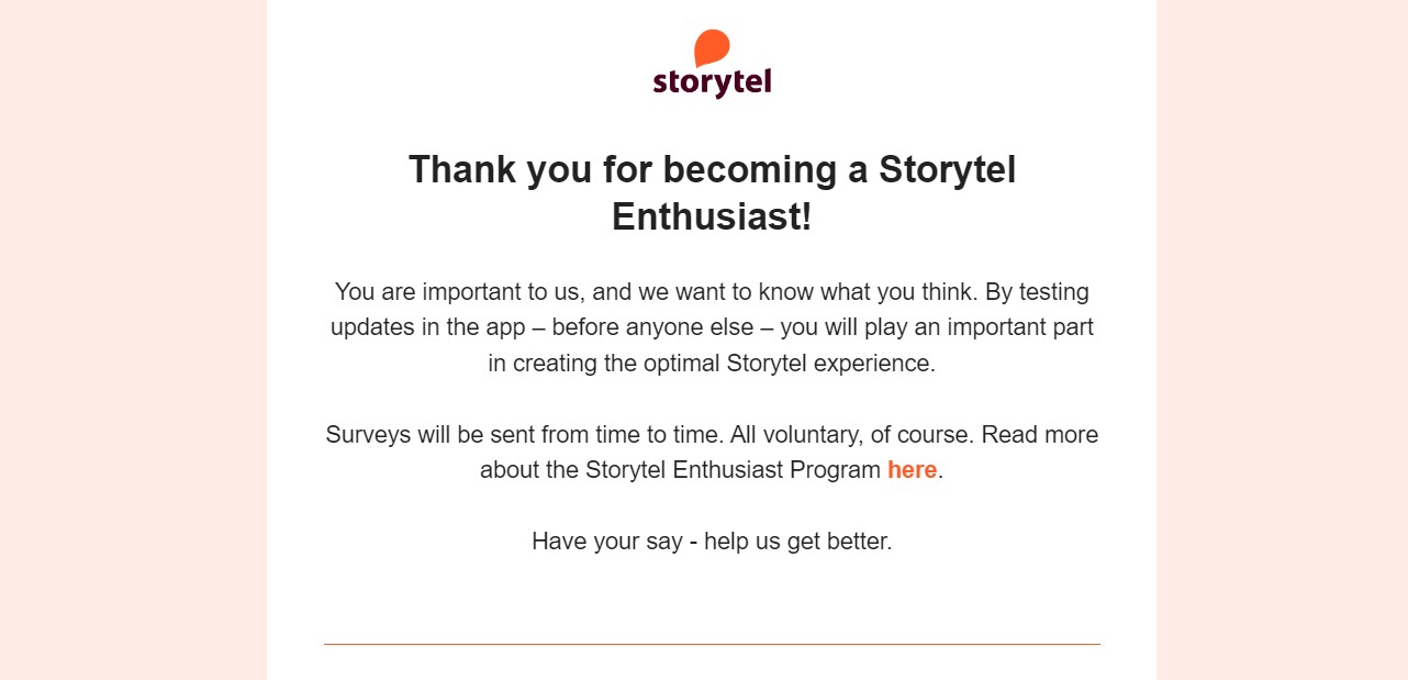
Image via storytel
6. Clearly mention the timelines for time-sensitive emails
If your transactional emails are time-sensitive or require an action from the reader, make sure you clearly highlight the timelines.
For example, if a subscription is ending in 30 days, make sure to mention that in bold. Or if a password-reset link is valid only for 15 minutes, make sure to draw attention to that.
7. Add clear calls-to-action
If you want the user to take action, use a clear and strategically placed CTA. Always highlight the most important information and make your CTAs clear and compelling.
Also, in some cases, you may also need to explain the process once someone clicks on the CTA. For example, if you want a new user to set up their account, don’t just add a CTA button, also explain how they can do so.
8. Set up Gmail inbox actions
By using Gmail inbox actions you can display some of the important data in your emails as a rich display in the inbox. For example, some emails can show “reset password” or other such CTAs in the form of a button.
Here’s a great illustration by Postmark that shows how these buttons look in a Gmail inbox.

Image via Postmark
9. Use the email footer strategically
Email footers are often underutilized, but actually are quite useful. You can add a lot of important information to your email footer, such as social media buttons, website links, unsubscribe links, contact information, and more.
This is an opportunity to drive users to engage with your brand more, without being intrusive or forcing additional information in the main email content.
10. Give your subscribers an easy opt-out option
This is the golden rule of email marketing—always give your subscribers the option to unsubscribe from your emails. Even better, let them decide which types of emails they’d like to receive and which emails they don’t want to receive.
You can do so simply by adding an unsubscribe link in the email footer and link them to the preference center. Some brands go the extra mile and provide a double opt-in option to guarantee that subscribers really do want to receive their emails.
11. Make sure your emails are mobile-friendly
In today’s digital world, where most people read their emails on the go via various mobile devices, this is one of the transactional email best practices you can’t ignore.
Use mobile responsive email designs and make sure your emails can be easily read on any device.
12. Include a plain text version of your transactional email
While mobile-responsive is great for mobile users, using a plain text email allows users with low internet bandwidth to open their emails. It’s about making your emails accessible to everyone, irrespective of their network bandwidth.
This is especially important for emails that provide important information to customers related to their purchase or subscription. You don’t want anyone to miss out on that just because of poor internet connectivity.
17 popular transactional email examples
Now that you have a fair idea of what transactional emails are and the best practices for sending them, let’s look at some great transactional email examples.
In this section, you will find 17 awesome transactional email examples from real brands to inspire your next campaign.
1. Account activation email example – Mailjet
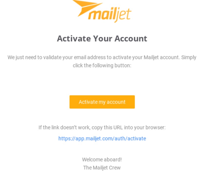
Image via Really Good Emails
Subject line: Mailjet – Activate your account
Why it works: The email has a simple message and a clear CTA directing new customers to click on the link to activate their accounts. And it also offers a failsafe, in case the CTA link doesn’t work.
Don’t forget the subtle welcome greeting at the end, to make customers feel welcome.
2. Welcome email example – COS
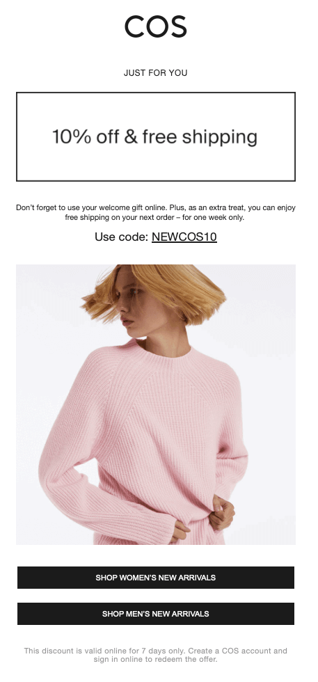
Image via COS
Subject line: Your exclusive welcome gift is waiting….
Why it works: In case you run an ecommerce business, don’t forget to offer an incentive for the first purchase to convert subscribers into customers faster.
COS does it successfully–the brand sends welcome email after the signup. The signup confirmation also brings the promotional value and converts.
3. Password reset email example – LinkedIn
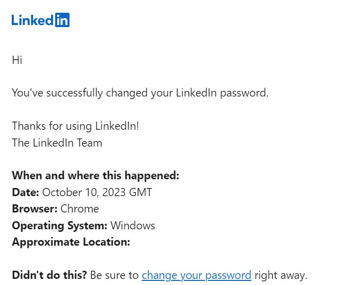
Image via LinkedIn
Subject line: Your password was successfully reset
Why it works: It informs the user of the recent password reset, along with all pertinent information, and also provides a way to take action if they didn’t reset it.
4. Account deactivation reminder email example – HubSpot
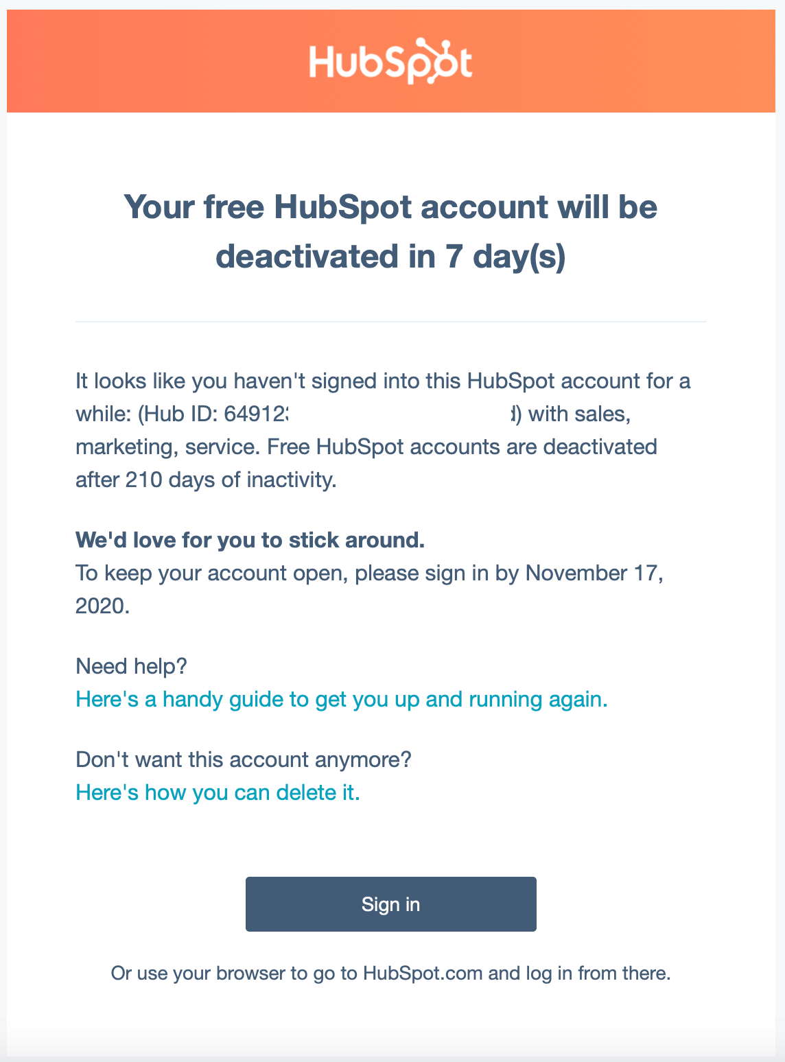
Image via Hubspot
Subject line: Your HubSpot account will be deactivated in 7 days
Why it works: It clearly highlights the urgency of the situation by mentioning the number of days left in bold.
5. Order confirmation email example – Flamingo Estate
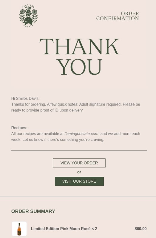
Image via Really Good Emails
Subject line: Order FE6500 confirmed
Why it works: It has a minimal design and provides all important details regarding the order and the delivery requirements. AND has a clear call to action come back to the store.
6. Shipping confirmation email example – Basic Piece
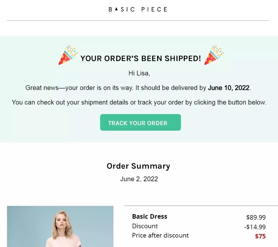
Image via Omnisend
Subject line: Your order’s been shipped
Why it works: It informs the reader that their order is shipped, provides essential order details, and gives an easy way for them to track their order.
7. Order cancellation email example – Nordstrom
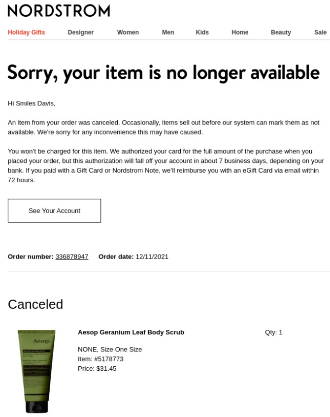
Image via Really Good Emails
Subject line: Smiles Davis, an item from your order was canceled
Why it works: It informs the user about the reason for cancellation, provides details of the refund, and also delivers a sincere apology.
8. Refund confirmation email example – ASOS
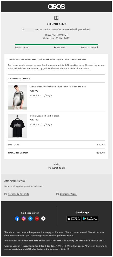
Image via Asos.com
Subject line: Your refund is on its way! 💸
Why it works: It confirms that the items have been returned, and the money refund will be processed. We like this example because it not only states that your refund is on the way but also provides information on the returned items, the refunded amount, links to the returns and refunds policy, as well as social media links and customer care. All these links are extremely relevant for customers who return items to the store and Asos plays it fair by featuring them.
9. Feedback collection transactional email example – Everlane
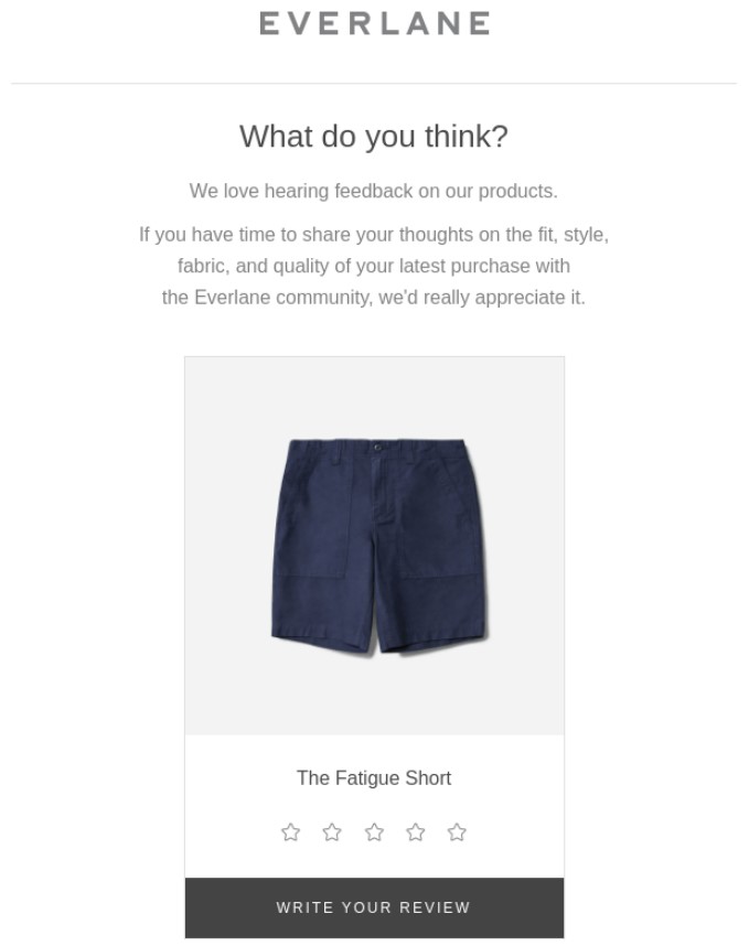
Image via Everlane
Subject line: Smiles Davis, share your thoughts!
Why it works: The product pictures and the star rating system make it convenient for customers to give their rating without leaving their inbox.
10. Abandoned cart reminder email example – Rael
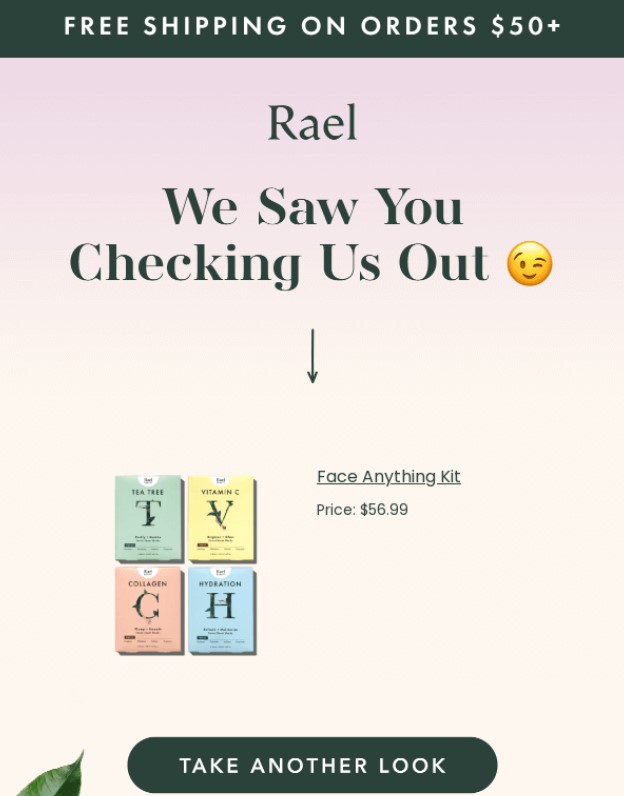
Image via Really Good Emails
Subject line: We noticed you, noticing us. 😉
Why it works: The product image tempts prospects to reconsider purchasing and the free shipping provides a further incentive to complete the purchase.
11. Free trial expiration email example – Squarespace
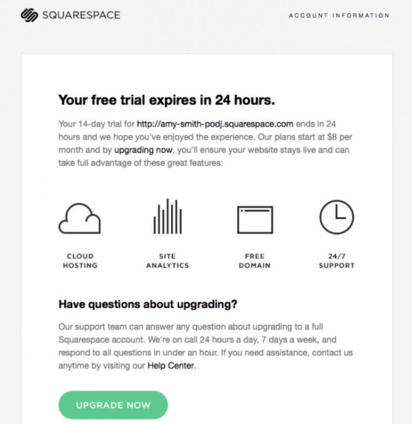
Image via ReallyGoodEmails
Subject line: Your free trial expires in 24 hours
Why it works: The most important message is written in bold at the top and creates a sense of urgency.
12. Event booking confirmation email example – TickeTing
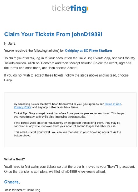
Image via MailerSend
Subject line: Claim your tickets from johnD1989
Why it works: It not only confirms the booking but also mentions important terms and conditions and the next steps.
13. Double opt-in email example – Beefree
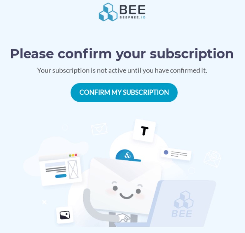
Image via Really Good Emails
Subject line: Please confirm your subscription
Why it works: With a minimal design and a big bold CTA, this transactional email has a clear focus—confirming that the user really wants to subscribe.
14. Account login notification example – DoorDash
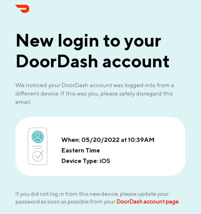
Image via Really Good Emails
Subject line: New login to your DoorDash account
Why it works: It provides information about the login and the next steps in case it was a fraudulent login attempt. With that sleek design and the use of colors, DoorDash made the most mundane transactional email engaging.
15. Payment receipt email example – Uber One
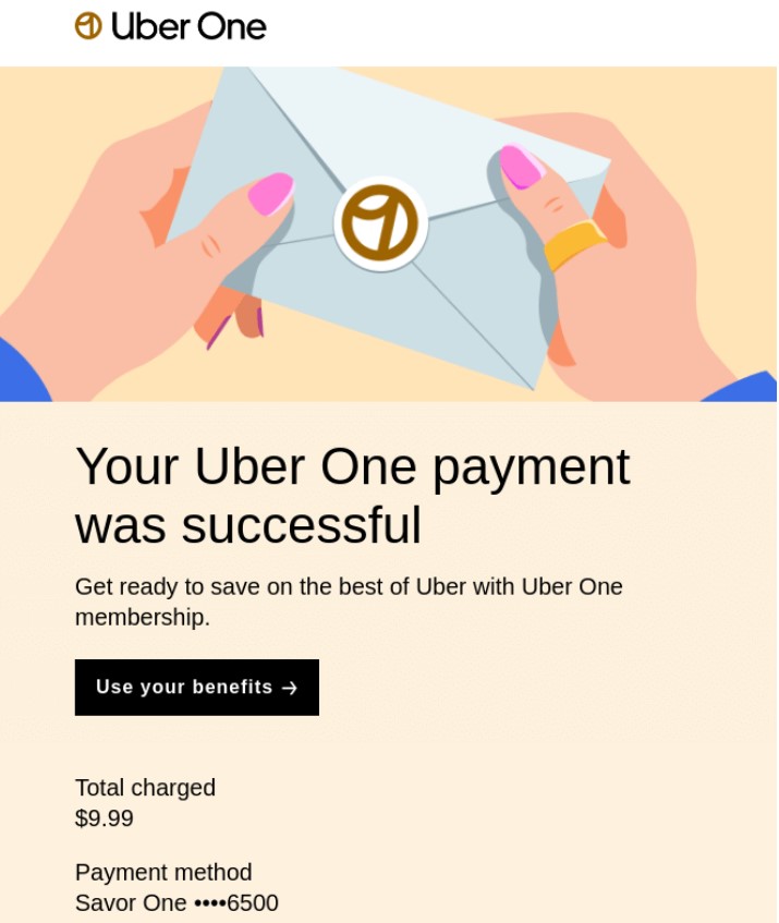
Image via Really Good Emails
Subject line: Uber One payment confirmation
Why it works: It is a simple, yet effective transactional email that provides all important payment-related information in as few words as possible.
16. Privacy policy update email example – Assemble Papers
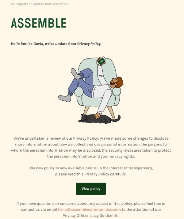
Image via Really Good Emails
Subject line: We’ve updated our privacy policy
Why it works: Adding a visual to an otherwise boring transactional email makes it engaging. This example covers all important information—an update, a CTA to read the new policy, and a way to contact the team—in very few words.
17. Thank you email example
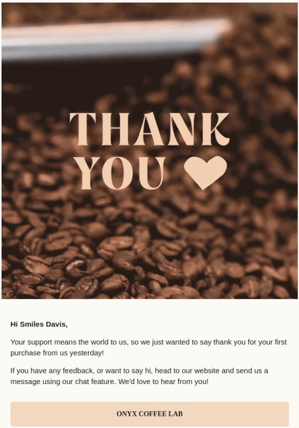
Image via Really Good Emails
Subject line: ☺️ You’re what makes us great!
Why it works: The simple design and the heartfelt note are enough to make any customer feel special and want to buy from the brand again.
Transactional email examples: Wrap up
There you have it—some of the best and most popular transactional email examples to inspire you for your own email marketing campaigns.
From a delivery notification email sample to abandoned cart transactional emails, there are email examples here for various purposes.
So, what are you waiting for? Start optimizing your transactional emails and make them more fun and engaging.