Let’s face it: some of your subscribers will choose to opt out. This can happen due to your irrelevant communication, or, conversely, the resolution of their pain points.
One way or another, you should provide a way to unsubscribe from your marketing campaigns. That said, senders can always give unsubscribers reasons to reconsider their choice.
This article will explore the concept of unsubscribe emails, along with the pros and cons of unsubscribes. Additionally, we’ll analyze real unsubscribe email and page examples and offer actionable tips to deal with unsubscribers.
Let’s get started.
Pros and cons of unsubscribes
Unsubscribes are frequent in email marketing, and it’s always hard to see them leaving.
However, unsubscribes also present some advantages. In this section, we’ll explore both the positive and negative aspects.
Here are a few reasons to welcome unsubscribes:
- Savings: Most email platforms charge for the size of subscriber list. So it’s better to keep only engaged subscribers and save money on the platform fee.
- List hygiene: Unsubscribes help maintain list hygiene by removing inactive or disinterested subscribers. This ensures that your email list remains relevant and engaged. Ultimately, this can improve deliverability rates and make your email campaign results more representative.
- Valuable feedback: When someone unsubscribes, they often have a reason for doing so. This could include disinterest in the content, receiving too many emails, or a change in preferences. Analyzing these reasons can reveal areas for improvement in your email strategy.
- Segmentation opportunities: Valuable data from unsubscribes facilitates audience segmentation. Let’s say that many of your subscribers unsubscribe due to receiving too many emails. Accordingly, you can segment your audience by email frequency preferences and adjust sending accordingly.
- Enhanced engagement: Email unsubscribes allow you to refocus your attention on your engaged recipients. This can lead to higher open rates, click-through rates, and ultimately, conversions. Inactive recipients in your list can skew your campaign performance metrics.
While unsubscribes offer benefits, it’s important to recognize their downsides. This understanding allows for optimizing email marketing strategies. So, I thought hard on the drawbacks and found only one tangible downside:
- Reduced reach: With fewer subscribers, your messages reach a smaller audience. This limits the reach of your marketing campaigns. Naturally, this can make it more challenging to achieve your marketing goals.
Therefore, senders should prioritize easy access to unsubscribe options. It’s best to offer recipients an opt-out option than to risk them labeling your emails as spam.
What is an unsubscribe email and unsubscribe message overall?
An unsubscribe email and webpage both serve a similar purpose: they allow recipients to opt out of future email communications from a business.
Most emails contain a link or button labeled “unsubscribe,” which leads recipients to a confirmation webpage for unsubscribing.
This webpage often includes a message acknowledging the recipient’s decision. It may also offer alternatives, such as adjusting email frequency or content preferences.
Unsubscribe emails, on the other hand, may target subscribers who aren’t engaging with emails. This proactive measure helps maintain a clean email list and improve deliverability.
Alternatively, they can also be sent post-unsubscribe. This allows you to request feedback on the unsubscribe experience or address concerns leading to the decision.
Let’s say a user unsubscribes from a cooking blog’s email list because they prefer vegetarian recipes. Understanding the user’s dietary preferences will help the sender tailor content to re-engage them in the future.
All in all, the unsubscribe process is crucial for respecting recipients’ preferences and for maintaining compliance with anti-spam regulations.
Used effectively, unsubscribe pages can also aid in retaining subscribers. They provide alternative communication options or address concerns before finalizing the unsubscribe decision.
Six unsubscribe email examples
Here are six real unsubscribe email examples for insights.
1. Feshto
Feshto sends users an unsubscribe email upon their request to unsubscribe. While brief and professional, the email effectively conveys both regret and optimism.
It begins with a simple message: “We hope you will be back soon.” Additionally, it acknowledges the common issue of crowded inboxes, empathizing with the user. This is followed by a clear, black call-to-action button. This way, users can re-subscribe if they wish to.
Being direct in your unsubscriber emails increases subscriber appreciation. They’ll leave with goodwill despite no longer being on your list.
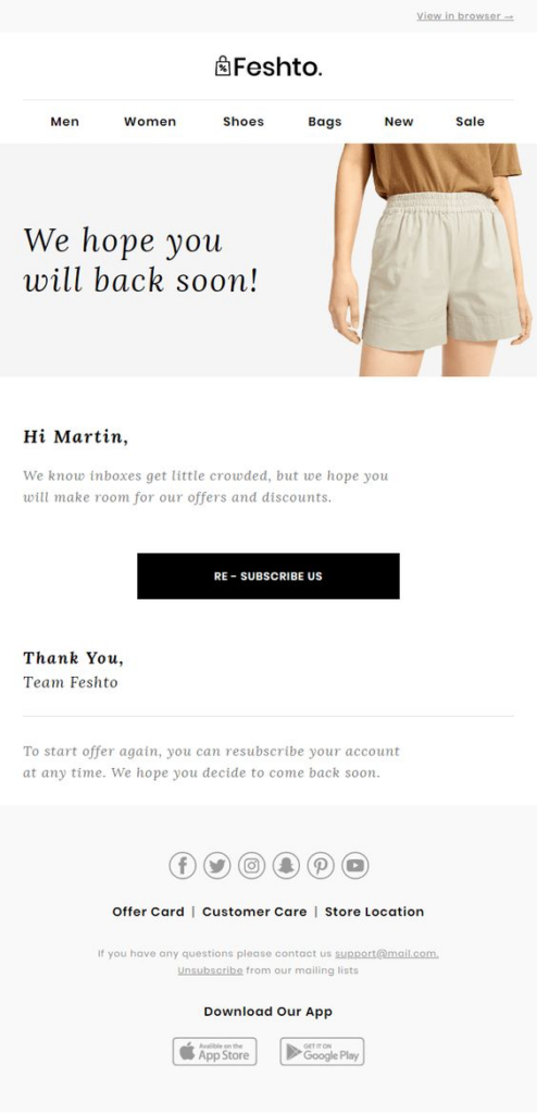
Image via Pinterest
2. JetBlue
JetBlue, an airline company, adopts a playful tone in its post-unsubscribe email. It starts with the quirky line, “Breaking up is hard to do.” It subtly highlights the benefits of staying subscribed, such as low fares and special promotions.
Using puns and wordplay, the brand then offers subscribers three options. They can either continue receiving emails, adjust preferences, or unsubscribe entirely.
What stands out in JetBlue’s email are the abundant icons and symbols. These effectively break up text walls, enhancing email readability. Additionally, it features an acrostic poem, showcasing the benefits of selecting JetBlue.
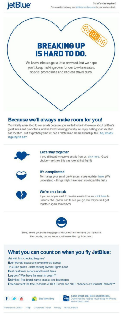
Image via Pinterest
3. Fitbit
Users may accidentally hit the unsubscribe button, resulting in the potential loss of subscribers. Confirming their intent before unsubscribing can help prevent this. Fitbit follows this very approach.
Its unsubscribe emails offer two choices: confirming unsubscribe or staying subscribed. Upon confirming, users receive a brief message. Fitbit delicately and respectfully acknowledges the departure, evoking a subtle sense of regret.
Overall, one standout aspect of this example is its simplicity. Fitbit also excels in aligning its email with its brand voice, identity, and colors. This is crucial as it ensures users leave on a positive note.
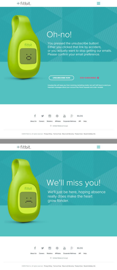
Image via Pinterest
4. Free People
Free People, a specialty lifestyle brand, employs an unsubscribe email strategy that is gaining traction. It involves assessing subscriber engagement levels. Then, it targets the least engaged individuals to inquire about their communication preferences.
Though initially counterintuitive, this method improves email deliverability and minimizes spam risks. Additionally, cultivating a more engaged subscriber base can improve vital metrics like open and click rates.
What’s more, Free People’s messaging is straightforward yet impactful. It begins with, “We haven’t seen you in a while.” This is followed by two clear call-to-action buttons: continue receiving emails or unsubscribe.
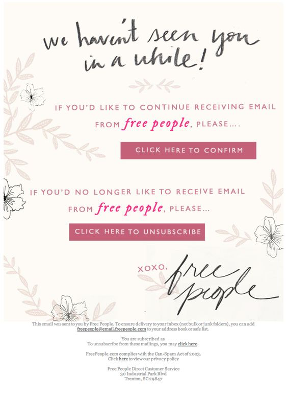 Image via Pinterest
5. Not On The High Street
Not On The High Street, an online marketplace, prioritizes a clean email list by actively sending unsubscribe emails to inactive users.
However, their approach stands out as they subtly acknowledge potential issues. To mend any concerns, they even offer a 10% discount. Users are also given the option to update preferences or unsubscribe entirely.
This unsubscribe email sets a great example by taking responsibility. It shows the brand as human and relatable, making subscribers more likely to stay.
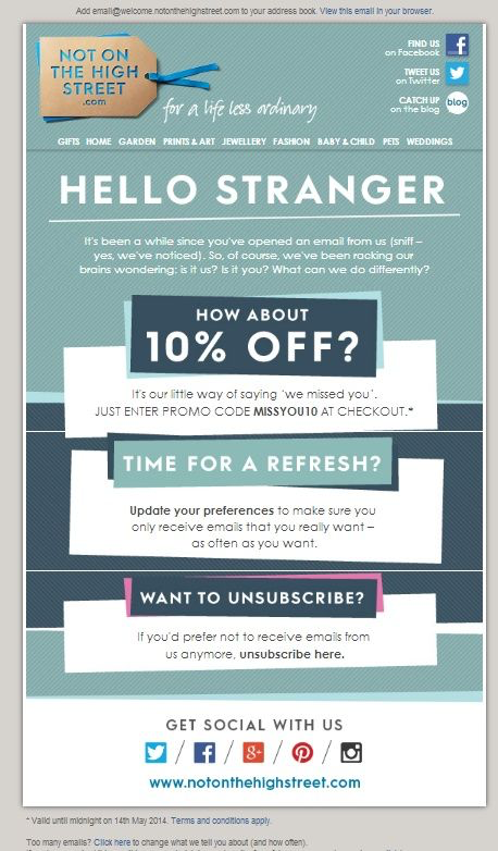
Image via Pinterest
6. Topshop
Topshop, a British fashion giant, recognizes the potential to change users’ minds about unsubscribing. In its email, it emphasizes the benefits of staying subscribed. Furthermore, it encourages users to share their interests for a tailored experience.
Notice the tone of the email. It’s very collaborative, fostering a sense of partnership in finding solutions. Additionally, the visually appealing email layout enhances readability and engagement.
Most importantly, the unsubscribe option is strategically positioned towards the end. This allows users to carefully consider their decision after reviewing their options.
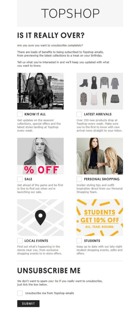
Image via Pinterest
Six unsubscribe page examples
An unsubscribe page serves as a valuable tool for understanding subscriber preferences. Additionally, it provides you with an opportunity to retain them. In this section, we’ll discuss six email unsubscribe page examples and why they work.
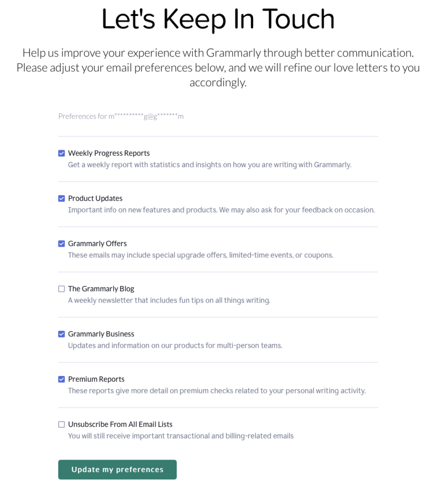
1. Grammarly
Grammarly is a digital writing assistant that facilitates smooth writing. Their unsubscribe page maintains a minimalist design.
However, it offers users the flexibility to customize their notification preferences. Users can also unsubscribe from all updates with a single button.
It’s crucial to prioritize simplicity in the unsubscribe process. Avoid making customers navigate hurdles to unsubscribe. Keeping it straightforward may even encourage users to reconsider subscribing in the future.
2. Refinery29
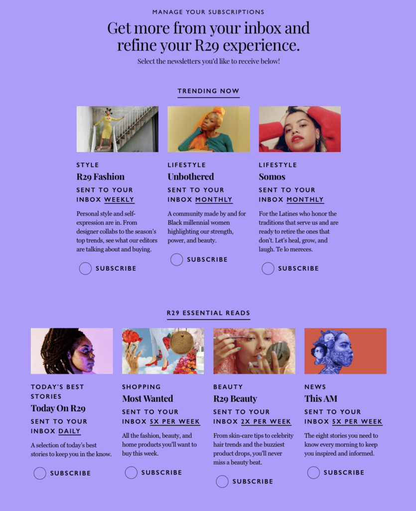
Unsubscribe pages should reflect brand identity as they’re often the final interaction with subscribers. Consistency in design, tone, and messaging upholds professionalism.
Refinery29, targeting young women, maintains a vibrant and youthful vibe on its unsubscribe page. This is evident in its visually appealing purple color scheme.
Moreover, the brand offers users numerous options to customize their preferences, including various newsletters with different frequencies. Users can explore their options and select what suits them best. Alternatively, they can opt to unsubscribe entirely or connect via social media instead.
3. Puma
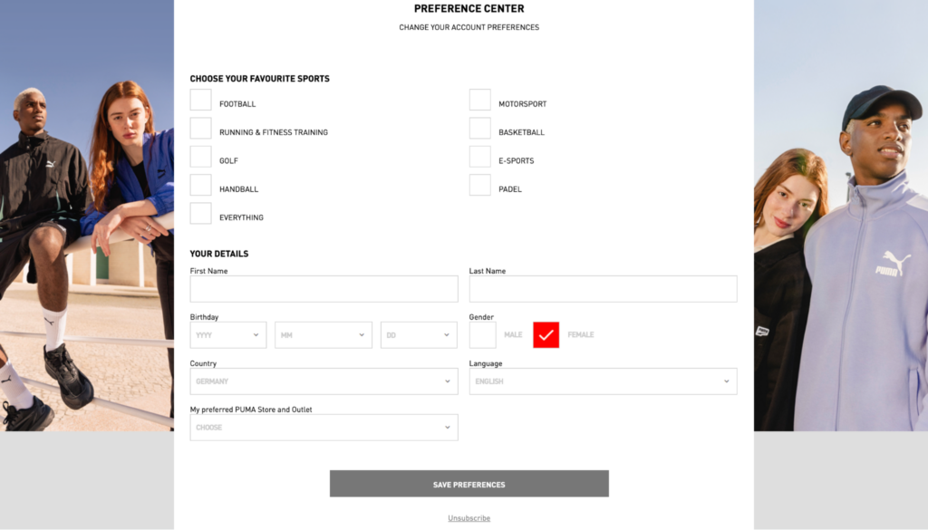
It’s widely acknowledged that personalized emails yield better results than generic ones. Thus, offer your subscribers the chance to customize the content they receive.
Puma exemplifies this approach. Upon clicking the unsubscribe button, users can update their personal details. Moreover, they can select their favorite sports.
Let’s say that you’re passionate about football. In this case, you can opt to receive football-related content and offers from Puma. Alternatively, there’s an option to unsubscribe entirely.
Also, notice how Puma’s unsubscribe page showcases products in action. Moreover, there’s ample white space to enhance digestibility.
4. The Epoch Times
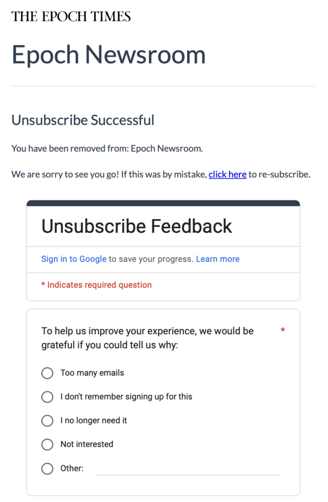
The Epoch Times is a multi-language newspaper and media organization. It offers readers an effortless way to unsubscribe. They only need to click a link in the email to complete the process.
The company expresses regret with a simple line: “We are sorry to see you go!” If there was a mistake or readers changed their minds, they can easily re-subscribe right away.
Here, the company invites users to share feedback for improvement. Users can select from various options or specify their reason for unsubscribing. These reasons present valuable opportunities to enhance your email marketing strategy.
5. Allure
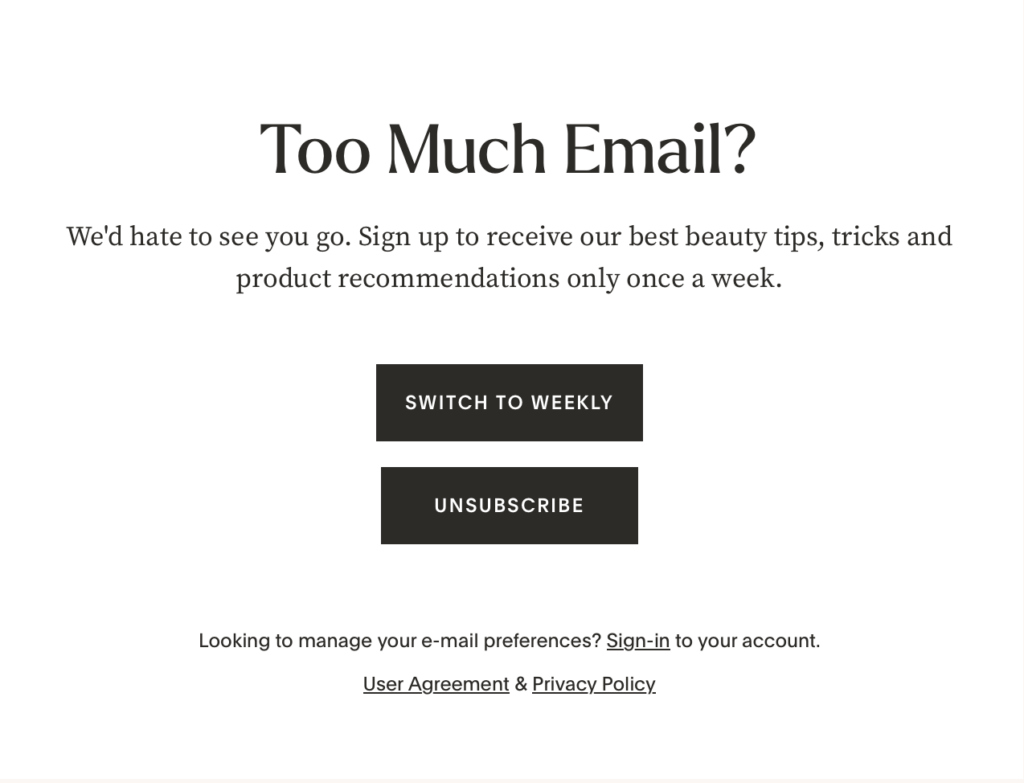
Allure is a magazine covering beauty, skincare, makeup, and wellness topics. It maintains a simple yet effective unsubscribe page.
It opens with the compelling message, “Too Much Email?” Many users are likely to resonate with this message as they seek to declutter their inboxes.
Additionally, it offers the option to stay subscribed but receive fewer emails. There’s also an emphasis on the benefits of remaining connected. These include access to top beauty tips, tricks, and product recommendations.
Highlighting subscription benefits on the unsubscribe page is often beneficial. It can retain users who are considering leaving.
6. Clarks
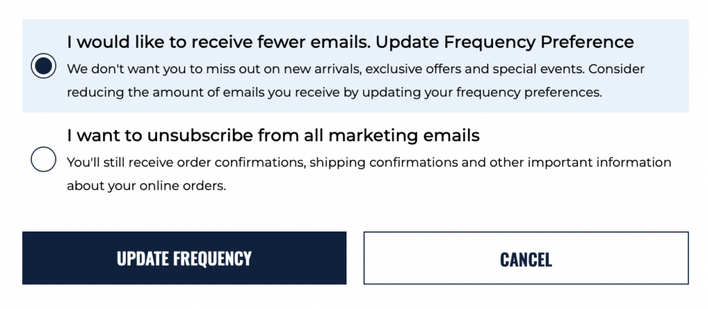
Clarks, our final example of an email unsubscribe page, opts for simplicity. Users are presented with two straightforward choices.
One lets them receive fewer emails, with a gentle reminder of the benefits. These include receiving updates on new arrivals, exclusive offers, and upcoming events.
The other option is to unsubscribe them from all emails. Additionally, there’s text reassuring users that they will still receive important updates. Clarks shows that even a concise unsubscribe page can effectively serve its purpose.
Tips for managing unsubscribes
Unsubscribes are bound to occur; they’re a natural part of email marketing. Striving for a low unsubscribe rate is crucial. But equally important is making the unsubscribe process easy and handling unsubscribes efficiently.
Here are some tips to assist you with that:
1. Keep things simple
Make sure it’s evident how to unsubscribe from emails. Display the unsubscribe link prominently in your emails. It should direct users to a straightforward, one-click unsubscribe page. Avoid making subscribers jump through hoops or fill out lengthy forms to opt out.
2. Comply with regulations
Be compliant with regulations to avoid penalties and complications. In the EU, for instance, readers must be able to unsubscribe with one click (single opt-out).
However, spam laws differ in the US, Canada, Asia, and Eastern Europe. Here, subscribers can confirm before finalizing their decision (double opt-out).
3. Respect subscriber preferences
Honor unsubscribe requests promptly to remove subscribers from your mailing list. Failing to do so can damage your reputation and violate anti-spam regulations.
Moreover, send confirmation messages to inform users they’ve successfully left your email list. This can occur either through a web browser or via email.
4. Offer helpful alternatives
Consider offering options for subscribers seeking to adjust email frequency or preferences. This could include options to receive fewer emails or to opt into specific emails.
5. Gather feedback
Use the unsubscribe process to gather feedback about why subscribers are opting out. This can help you identify areas for improvement. You can provide a brief survey or an open-ended question to do this.
6. Maintain brand consistency
Ensure your unsubscribe page and confirmation message match your brand’s tone and identity. This helps maintain a positive experience for subscribers even as they choose to opt out.
7. Express gratitude
Avoid using negative language on your page and confirmation messages. Instead, thank subscribers for their past engagement. Express appreciation for their time on your email list.
A gracious tone in your messages can create a positive final impression. This may encourage subscribers to re-engage with your content in the future.
Wrap up
If a subscriber opts to unsubscribe from your emails, they’re likely to stick with that choice. However, by providing alternative options, you can potentially sway their decision.
Crafting a user-friendly unsubscribe page is crucial in influencing these decisions positively. Hopefully, the unsubscribe email and page examples in this article give you a good place to start.
Make sure your unsubscribe process reflects your brand values and respects user choices. Remember, simplicity is key—make it easy for subscribers to opt out if they wish.
Managing unsubscribes effectively boosts email deliverability and ensures messages reach interested subscribers. Ultimately, it can lead to better-presented marketing results.
