Cyber Monday is a major online shopping event during the Thanksgiving sales season. It’s become so huge that it now rivals the frenzy of Black Friday as a holiday shopping peak.
Each year, online retailers anticipate a sudden spike in sales during this time. They’re also usually eager to explore different strategies to increase their revenue.
In 2023, Cyber Monday sales surged to $12.4 billion in the US alone, according to Adobe Analytics. This remarkable sales increase highlights the opportunities for brands during this period.
Email marketing, in particular, is a proven method. Well-designed Cyber Monday email series can capture attention, drive traffic, and boost sales.
To provide inspiration, we’ll explore ten outstanding email examples with the Cyber Monday theme. These emails showcase innovative designs, compelling content, and practical strategies.
From these examples, you can gather practical tips to help you create impactful Cyber Monday email marketing campaigns.
Why is Cyber Monday so important?
The Cyber Monday holiday originated in 2005. Retailers noticed a surge in online shopping activity on the Monday following Thanksgiving weekend.
Capitalizing on this trend, they began offering exclusive online deals after the Black Friday weekend. This strategic move yielded sales growth and helped promote online holiday shopping.
Nowadays, Cyber Monday has blended into Thanksgiving and Black Friday sales online, and they all together make Cyber5 the biggest sale of the year.
Make sure you have the strategy in place because this sale is getting bigger every year, and you will definitely want a piece of that sales cake for yourself.
How to create a stunning Cyber Monday email campaign?
A well-executed email campaign allows you to capitalize on the holiday shopping spirit to enhance your brand’s visibility and drive sales.
Here are the key elements you need to consider:
Planning and strategy
Cyber Monday is part of the broader Cyber5 sales period. This shopping holiday kicks off with Thanksgiving and often runs through the following Tuesday.
When planning your Cyber Monday email campaign, consider the entire Cyber5 sales period. Ensure your messaging is consistent and can build excitement throughout the holiday shopping season.
Begin by mapping out your campaign timeline. Consider each day’s unique opportunities within the Cyber5 period and how they can build on the previous one.
Every year, ecommerce sites start email communication earlier. You should consider doing this as well. Start with Thanksgiving-themed emails a week or two before the actual occasion.
Follow this up with Black Friday discounts. Then, shift the focus to your Cyber Monday email and provide exclusive online offers. The days after Cyber Monday can help clear out remaining stock with final discounts.
Email design and content
As with any email campaign, both the design and content are important. Here are some tips to improve your Cyber Monday email design and content:
- Highlight the exclusive value proposition: Your email should communicate why your offer is valuable. Start with a compelling subject line that grabs attention and a strong headline in the email body. Use concise language to explain the benefits and exclusive deals you’re offering.
Include specific details like discount percentages, limited-time offers, or unique product features. Ensure the value proposition is the first thing your audience sees to keep them hooked.
- Maintain branding consistency: Consistency in branding can build recognition and trust. Maintain consistency in your Cyber Monday email series — not just in your brand’s visuals but in your brand voice as well.
- Use bold and theme-oriented design: Cyber Monday is a major online shopping event, and your email design should reflect that. Use bold visuals and colors that align with the theme.
- Use an easy-to-scan layout: Some recipients just scan their emails, so make it easy for them. Use a clear, hierarchical structure with headlines, subheadings, and bullet points.
Short paragraphs and plenty of white space help prevent clutter. Lastly, include clear CTAs that stand out, guiding readers to the next step.
Special offers and promotions
Promotions are the heart of any successful Cyber Monday email campaign. Plan a variety of special offers to cater to different customer segments and improve campaign effectiveness.
Consider exclusive online-only deals, significant discounts on popular products, or bundled offers that provide additional value.
You can also create a tiered discount strategy to incentivize higher spending. For example, offer a 10% discount for orders over $50, 20% for orders over $100, and so on.
Also, consider offering flash sales that last only a few hours to drive urgency and prompt action. Text messages are extremely effective in supporting flash sale communication. Make sure you start collecting phone numbers in advance to use this marketing channel.
Best Cyber Monday email subject lines
The subject line is the first thing your subscribers will see. That’s why it has to be attention-grabbing and compelling. Here are some tips to follow:
- Make it concise: Aim for under 50 characters to ensure full visibility on mobile devices.
- Highlight urgency: Emphasize the exclusivity and urgency of your Cyber Monday deals. You can use phrases like “Limited Time,” “Last Chance,” or “Today Only” to portray this.
- Personalize it: Include the recipient’s name or reference their past purchases for a more tailored feel.
- Use numbers and emojis: Include numbers to showcase discounts and use emojis to grab attention.
Ten Cyber Monday email examples for 2024
Draw inspiration from these ten best email samples for your Cyber Monday email campaign:
1. Oobli
Subject line: 🚨 Last Chance: Final Hours for Cyber Monday Sale!
This email from Oobli is a good Cyber Monday sales message example. The content is straightforward, highlighting the discount clearly to capture the attention of potential buyers.
The offer is highly attractive, providing a 50% discount and free shipping on orders over $20. The email is well-designed and uses contrasting colors of blue and green to ensure that the important elements stand out.
While the email is effective, it could be improved by showcasing a few specific products included in the Cyber Monday sale. This can give subscribers a clearer idea of what they can expect to find and nudge them towards making a purchase.

Image via Really Good Emails
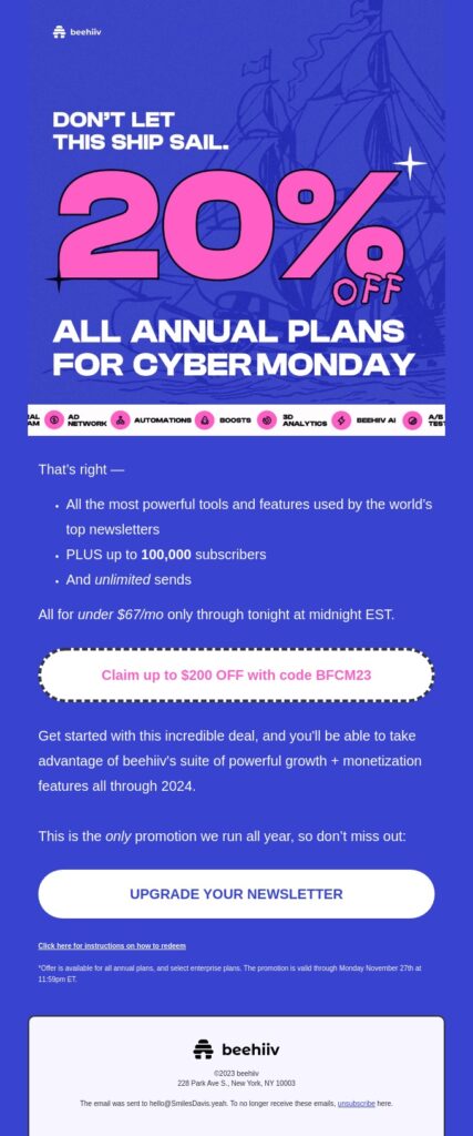
2. beehiiv
Subject line: 🤖 Cyber Monday is here
beehiiv creates a sense of urgency in this email as it uses a compelling email copy and offer. What makes this email effective is its clear message. Although, for my taste, email copy is a bit too long.
Customers know exactly what they will get — a 20% discount on all annual plans. It also provides a brief description of the benefits of annual plans.
Additionally, the email maintains a consistent brand visual by sticking to its brand colors of blue and pink. The design also uses varying font sizes to create a clear hierarchy and emphasize the most important information.

Image via Really Good Emails
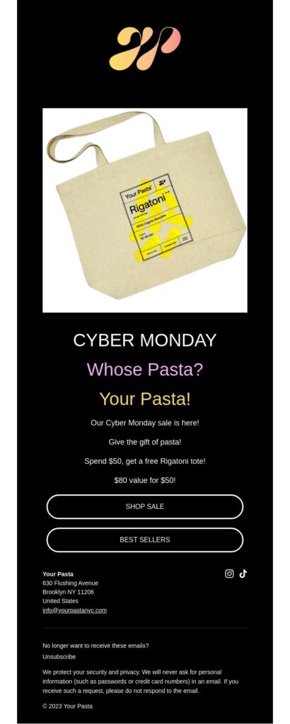
3. Your Pasta
Subject line: Your Pasta Cyber Monday Sale
This Cyber Monday email from Your Pasta stands out for its touch of humor and simple design. It follows a well-structured layout that includes concise yet informative text. The copy outlines the sale details and provides a direct link to shop online.
The hero image is another of its distinct element, featuring a beautifully branded bag to show the product. The text announcing the Cyber Monday sale is strategically placed below the product image. Using large, bold fonts and contrasting colors ensures it stands out.

Image via Really Good Emails
4. Kizik
Subject line: LAST CALL for Cyber Monday deals
This Cyber Monday email from Kizik balances appealing design and messaging.
It’s well-structured and features a bold header to display the Cyber Monday theme. The inclusion of product images and prominent CTA buttons make it easy for the reader to visit the website and make a purchase.
However, the email missed highlighting specific Cyber Monday deals or discounts. This could’ve enticed recipients with the value proposition and driven higher conversion rates.

Image via Really Good Emails
5. DJI
Subject line: Cyber Monday Specials Await!
Brands often combine the Cyber Monday sale with the Black Friday event to create a grand shopping extravaganza. The email by DJI is an example.
The use of bold typography and contrasting colors makes the headline stand out. The message is clear: DJI is offering 30% off on its deals as an extension of the Black Friday sales wave.
The email’s layout is clean and organized. Products and deals were categorized effectively to allow quick scanning.
Providing separate CTA buttons for each product is a smart move to guide users to those pages and deliver a smoother shopping experience.

Image via Really Good Emails
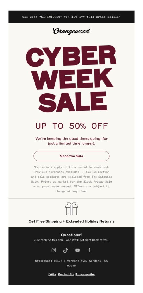
6. Orangewood Guitars
Subject line: Happy Cyber Monday
This Cyber Monday email is a well-structured example that promotes Orangewood’s holiday sale.
The bold opening line announces that the sale will last a week. By offering ‘Up to 50% off’, the brand successfully lures readers into clicking the CTA button and exploring the items on sale.
While many brands choose to explicitly display their sale offerings, Orangewood maintains a bit of mystery in this copy. It’s a smart move to increase click-through rates.

Image via Really Good Emails
7. Jeni’s
Subject line: LAST CALL for free pints!
Through this Cyber Monday deal, Jeni’s offers customers a special treat. It encourages customers to buy five and get one extra, which is a smart move to increase the basket value.
The pop-color background effectively highlights the product images and bright text. CTA buttons create a sense of urgency and nudge readers to place their orders right away.
While this email has good things, it has something I should offer to improve. First of all, the main image looks weird and low quality. Make sure your main image is top-notch and of the highest possible quality. Second, the brand could have enhanced the interest of buyers by showcasing different flavors of DELICIOUS ice cream or including images of customers enjoying their ice cream.

Image via Really Good Emails
8. Buoy
Subject line: 👾 Cyber Monday! 30% off subscriptions
Buoy introduces a special Cyber Monday offer designed exclusively for new subscribers. The email structure is non-cluttered, the use of bold fonts draws the attention of the readers, and the use of brand colors adds more value to the design.
The message is clear. Buoy is extending a generous 30% discount on new subscriptions. This email aims to expand the brand’s customer base. Multiple CTA buttons strategically create urgency to prompt quick action.
However, including the product name or incorporating a few images would’ve enhanced the audience’s understanding of the offer.

Image via Really Good Emails
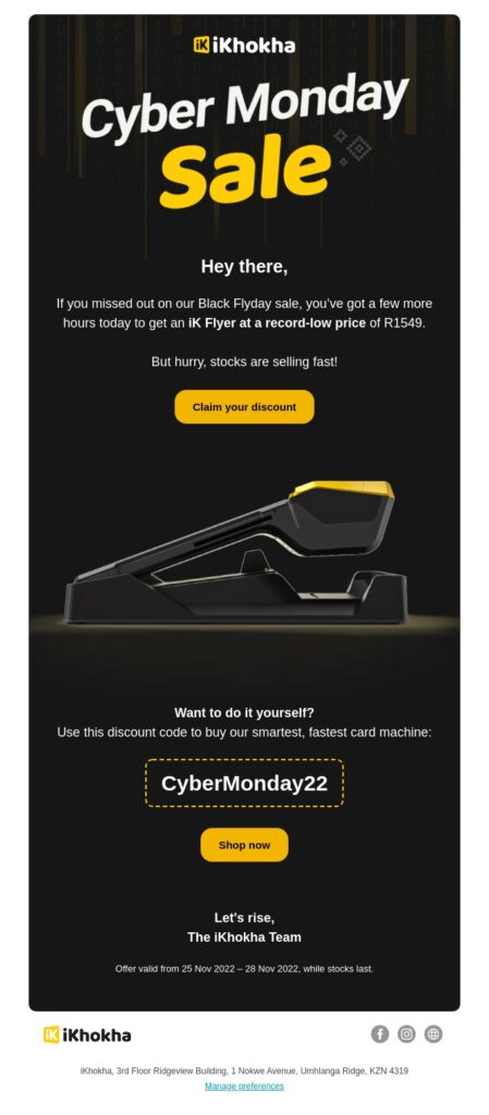
9. iKhokha
Subject line: 24 hours left on Cyber Monday ⏰
This email strategically targets a Cyber Monday consumer who may have missed out on Black Friday deals.
The deliberate use of black and yellow colors extends the Black Friday concept, creating a cohesive visual theme that resonates with the audience. Coincidentally, these are the brand colors of iKhokha.
Clear and compelling CTA buttons urge the reader to claim the discount and shop. This effectively drives engagement and prompts immediate action.

Image via Really Good Emails
10. Teepublic
Subject line: *Extends sale* Up to 40% off sitewide!
This email is my favorite. It is a great example of creating a sense of urgency around a sales event. Extending the sale period is a clever tactic, targeting shoppers who may need a final nudge to complete their purchases.
The prominent countdown timer reinforces the limited-time nature of the deal. Also, the email’s visual appeal is striking, with bold, colorful graphics that can capture interest.
The email showcases some popular discounted items as a teaser to nudge them to click the CTA and visit the store.

Image via Really Good Emails
Wrap up
Cyber Monday is the perfect way to close the Thanksgiving shopping season. Your subscribers are in the mood to spend extra. With a compelling copy and an irresistible offer, you can maximize sales.
Take inspiration from the ten outstanding examples discussed in this post to craft your impactful Cyber Monday emails.
You should plan your email series for a comprehensive impact. Remember to focus on clear messaging, compelling offers, and eye-catching designs. Lastly, infuse your brand voice in your campaign in a creative way.
Go ahead and craft a compelling campaign to grab attention and boost revenue.
