Email marketing remains to be a powerful digital marketing tool for businesses. According to the latest data, Omnisend merchants get an average ROI of $72 for every $1 spent.
However, these kinds of results don’t just happen.
You have to find ways to captivate subscribers, encourage them to take the desired action, and find ways to build loyalty to avoid unsubscriptions.
This is relatively easy to achieve, provided you know the top email newsletter best practices.
Read on to explore expert-recommended best practices for email newsletters and power up your strategy to achieve more significant ROI.
Let’s get started.
11 Email newsletter best practices to follow
Email newsletters are a proven marketing tool to interact with your audience on a regular basis. To turn them into relation-building, revenue-generating means, you need to follow the best practices.
Here are the top eleven email newsletter best practices you can follow to create compelling subject lines, content, CTAs, and more.
1. Inform subscribers about what they’re committing to
Be transparent in your signup forms. Tell subscribers about the kind of communications they’ll receive through your email newsletter.
There are several benefits of sharing this information:
- When your subscribers know what they are committing to, they’re less likely to report your newsletters as spam.
- It answers the question, ‘What’s in it for me?’ Sharing the benefits that the individual stands to gain encourages more signups.
- It sets clear expectations. This means the people who sign up for your email newsletters are likely to be genuinely interested in the content you promise.
You can include a section in your signup form that discloses this information.
Don’t be vague. Give specific details of the content of your email newsletters.
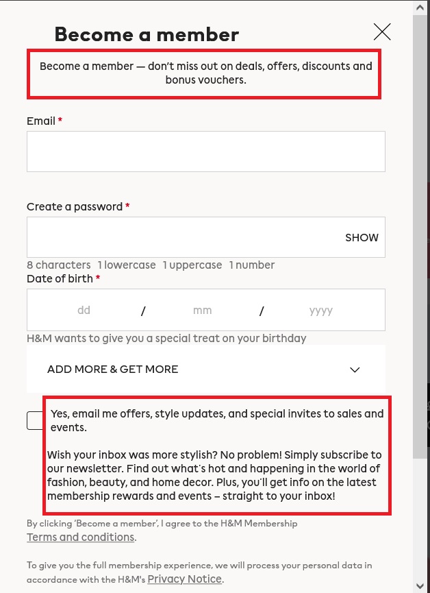
This signup form from H&M is a good example. It clearly indicates what kind of communication and information the users can expect from the brand.

Image via H&M
2. Craft newsletters that provide value to your audience
An email newsletter is a valuable tool for promoting your products and services. However, try not to make this their primary purpose. We suggest mixing promotional content with educational and informational – share something valuable for your customers.
Here are some common types of alternative email content you can share:
- Educational content, such as how-to guides and tutorials (for example, how to take care of your new cashmere sweater, tricks on how to make your lipstick stay longer, how to take care of your new white sneakers, etc.)
- News updates, like the latest industry news, events, and reports
- Product updates, such as new features and improved support options, or hacks on how to use the products better
- Latest blog posts, interviews, podcasts, YouTube videos, etc.
- Downloadable resources like ebooks and whitepapers
- Membership updates
You can always find out the type of informational content your subscribers engage with most by analyzing your email marketing metrics. Capitalize on the content type that brings in the best results.
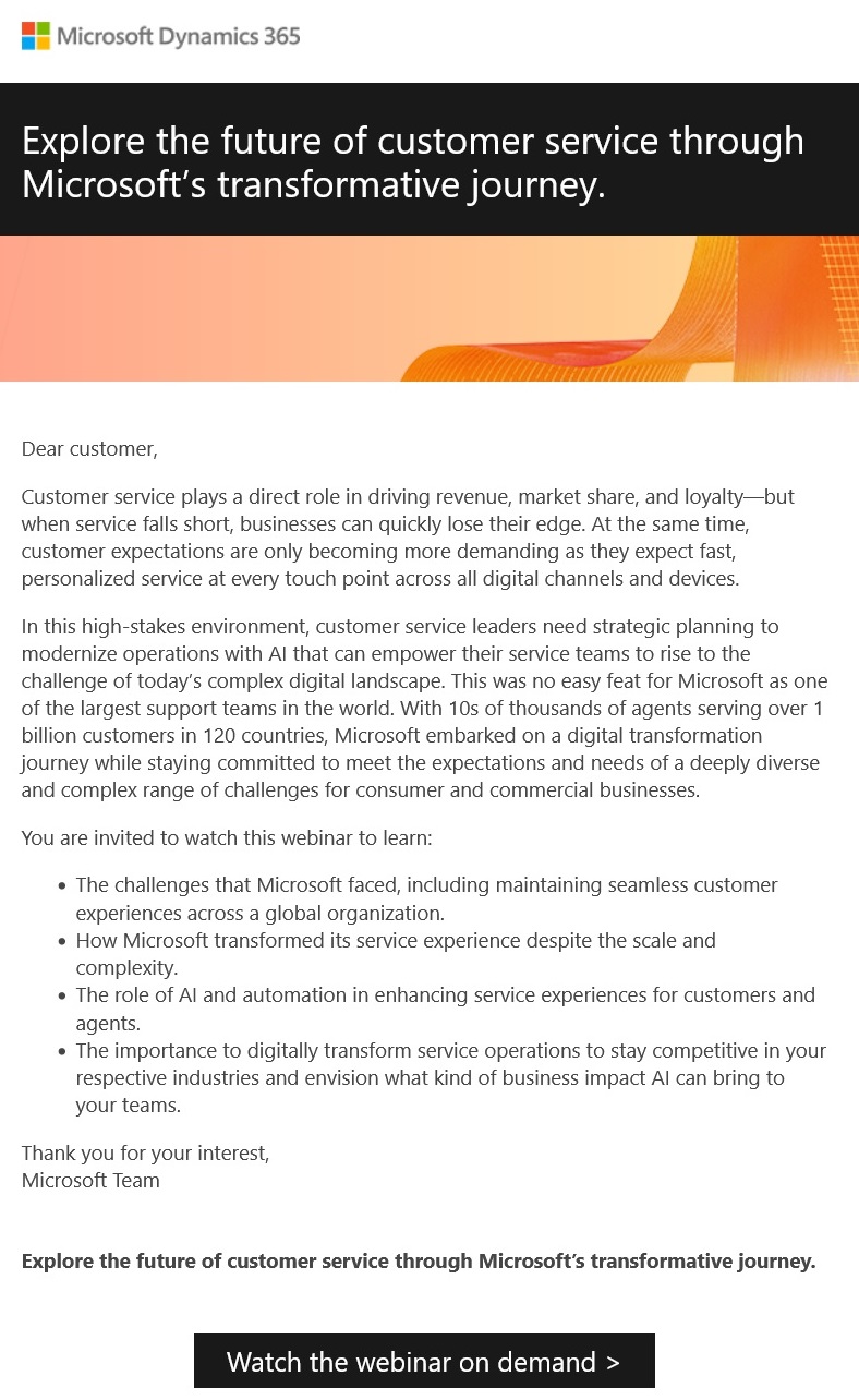
Here’s an example of an informational email newsletter from Microsoft Dynamics 365.
It’s an invitation to an educational webinar. Note how there’s zero promotion of Microsoft’s products.

Image via Microsoft Dynamics 365
3. Choose a brief and captivating subject line
Craft catchy email subject lines that get your subscribers to notice your newsletters and open them.
Catchy subject lines are short, preferably between 40 and 60 characters. This length guarantees that they’re fully visible on your subscribers’ devices.
Good subject lines are also clear and intriguing. They hint at the email’s content to create curiosity without giving too many details. This increases open rates.
Here are some email newsletter best practices that can help you craft better subject lines for your audience:
- Use emojis when appropriate to make your subject lines stand out in the inbox
- Personalize the subject line using the recipients’ names or other personalized information
- Use action words to encourage the reader to take action, such as ‘learn’ or ‘discover.’
- Maintain relevance. The subject line should align with the content of the newsletter
- Use emotionally charged words to spark action, such as ‘valuable,’ ‘authentic,’ etc.
- Always write the preview/preheader text.
Luckily, many email platforms, like ActiveCampaign, Mailchimp, Klaviyo, Omnisend, offer AI tools, subject line generators to facilitate your email marketing tasks.
4. Maintain clarity and brevity in your content
A long block of redundant text is likely to make your subscribers close the newsletter as soon as they open it. This means you don’t get to communicate your message.
Besides, clear and concise content makes it easy for the recipients to understand your email newsletter. It leaves little room for misinterpretation and miscommunication.
Here are some best practices for maintaining clarity and brevity in your email newsletter content:
- Be clear on what you want to communicate or achieve with the newsletter.
- Get to the main point in your first sentence or paragraph. The subscriber shouldn’t have to look for the key information in the content.
- Use short and concise paragraphs. Cover one idea per paragraph.
- Use bullet points or numbered lists to increase its readability. You can use them to outline steps, features, etc.
- Stay on topic. Eliminate any content that doesn’t contribute directly to the message.
5. Enhance your email newsletter’s design
Stick to best practices of newsletter design. Well-designed emails are visually appealing. They give subscribers a better user experience.
Good design makes it easier for subscribers to consume the content, leading to a higher click-through rate.
What are some of the best practices of newsletter design you can implement? Let’s get to it:
- Have enough white space in the email newsletter. It makes it appear less cluttered.
- Your CTA buttons should be concise and with action words. They should have contrasting colors to make them stand out. Ideally, the email should have one bright CTA, or at least one above the fold. Don’t include too many different buttons in your email.
- Use the Z-pattern format to guide readers through your content. It uses how the eyes naturally travel when reading—left to right, down to the left side again, and then to the right.
- Leverage visual hierarchy. The most important content should come first.
- Strike a balance between text and visuals.
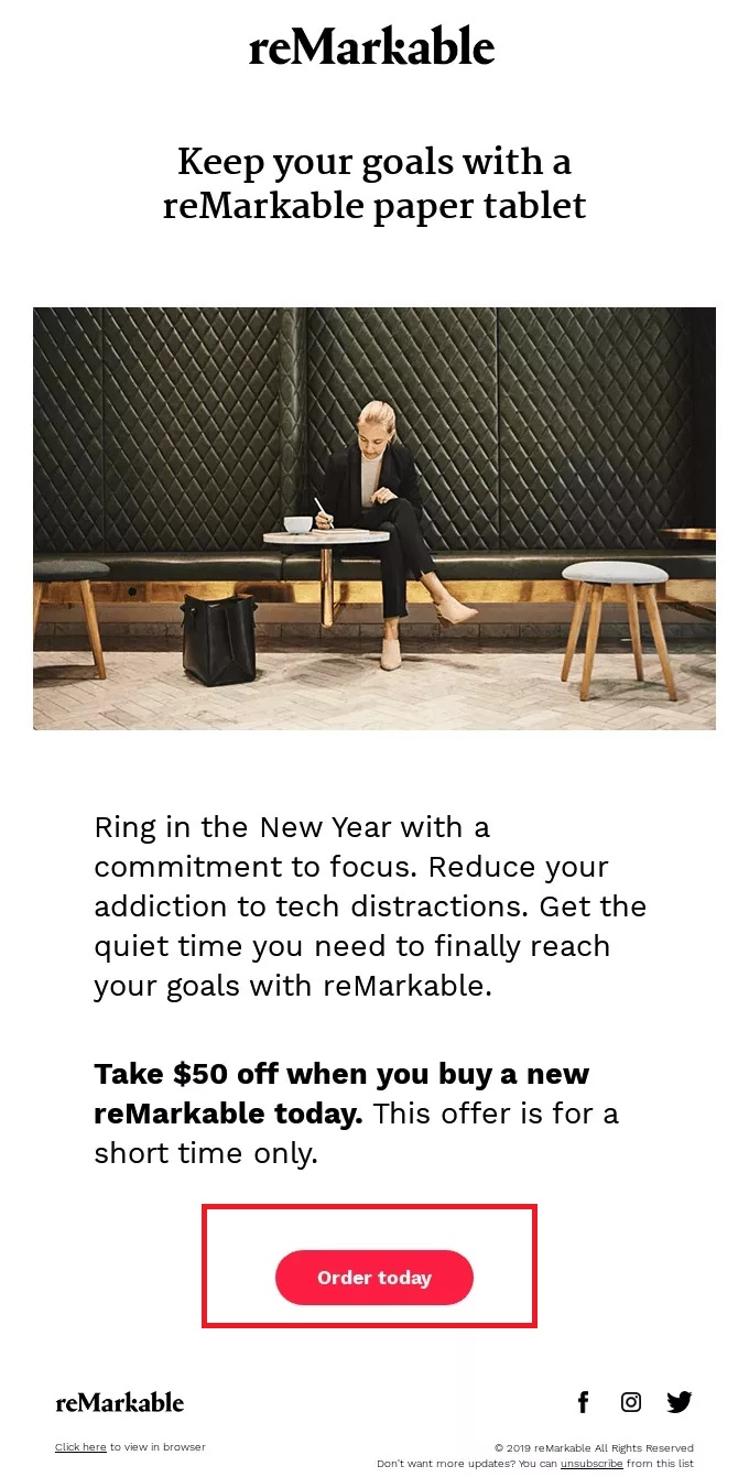
See this email newsletter from reMarkable, for instance.

Image via reMarkable
Using whitespace effectively draws the reader’s attention to the vital information and the CTA. The red CTA button against a white background makes the CTA stand out.
6. Make sure your newsletters align with your brand’s identity
Your email newsletters should be consistent with the core elements of your brand.
This is what it means:
- The color scheme, logo, typography, and imagery should match your brand’s visual identity.
- The tone and voice of your newsletter content should be in line with your brand’s personality and other marketing assets
- The stories you tell in your email newsletters should match your brand’s narrative, such as its history and achievements
- The content should always match your brand’s mission, products, and values
Despite the type of content or the theme of your email newsletter, each should align with your brand’s identity. This consistency signals authenticity and reliability to your subscribers.
It builds their trust and makes your regular email newsletter instantly recognizable.
Besides, showing your brand’s unique personality distinguishes your newsletters from competitors’ emails in your subscribers’ inbox.
7. Adapt your newsletters for mobile devices
In the second quarter of 2023, about 95.8% of users globally, accessed the internet using their mobile phones.
It leads to the natural conclusion that most of your subscribers access your email newsletter through their mobile devices.
Therefore, ensure your email newsletter displays and functions properly on smartphones.
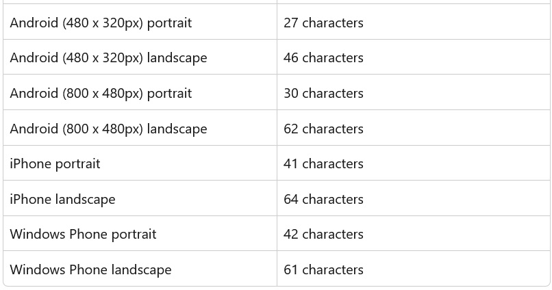
We said earlier that a good subject line is about 40 characters. However, to optimize it for mobile, make sure the most critical information is within the first 27 characters.
It’ll keep essential details from being cut off from view.
Here’s a breakdown of the character length displayed on Android and iPhone devices.

Image via Omnisend
Here are some other email newsletter best practices to follow in this regard:
- Work with responsive email templates. This is a template that makes your email newsletter automatically adapt to any screen size.
- Ensure that the essence of the newsletter is fully communicated through the copy, even if the images don’t load. It’s important because some mobile devices don’t display images by default.
- Make your CTAs thumb-friendly by leaving enough white space around them. It should also be at least 44 x 44 pixels.
These practices sound techy, but email providers usually offer professional, good-looking email templates that are already responsible and mobile-friendly. Check out template libraries of tinyEmail, Privy, Omnisend, Flodesk or Klaviyo. These platforms pay a lot of attention to modern and professional email designs.
8. Segment your email list and send relevant newsletters
Personalization across all touchpoints is critical in every aspect of business. A research study shows personalization has helped 62% of leaders improve customer retention.
An effectively personalized email newsletter goes beyond using the subscriber’s name. The content and product recommendations are personalized based on:
- Location
- Demographics like age, gender, and marital status
- Purchase history
- Browsing behavior
- Stage in the buyer’s journey
- Psychological traits like values, desires, and lifestyle choices
To achieve this level of personalization, segment your subscribers. Divide them into smaller groups based on the above criteria.
Next, leverage dynamic content in your email automation. This is email content that changes based on the personalization data you’ve provided about a recipient.
Applying these tips helps you send highly relevant newsletters that boost engagement.
9. If feasible, include only one CTA in your newsletter
Adding effective CTAs is one of the best email newsletter best practices you can apply. However, overusing them can do more harm than good.
The best approach is to add one powerful CTA at the end of the email newsletter.
It communicates a clear and focused message on the next step the subscriber should take, removing any confusion multiple CTAs can cause.
Having one CTA carries other benefits like:
- They reduce decision fatigue. Multiple CTAs present the subscriber with too many options. If they’re unsure of which decision to take, they might not take any action at all.
- A single CTA creates room to optimize its design, placement, and wording for maximum impact.
- Having one CTA makes tracking the performance of your email newsletter by tracking its click-through rate easier.
Have a look at this email newsletter from Uniqlo. It has one powerful CTA placed at the top of the content, which is hard to miss, and the same CTA “Shop now” repeats throughout the email.

Image via Uniqlo
10. Send regular newsletters
Sending email newsletters too often can lead to unsubscribes. However, sending them infrequently can also make you lose your subscribers’ interest.
How many email newsletters should you send? Omnisend data shows the best email frequency for small business marketing to be 10–19 emails per month. It draws the best results.
However, this isn’t a magic number that applies to every business.
The frequency will depend on the strength of connection you have with your audience and the nature of your business.
You can use surveys and feedback to determine what frequency your subscribers prefer.
Monitor your key engagement metrics as well. If you apply a certain frequency and experience a decrease in open rates and click-through rates, try adjusting it.
Whichever frequency you choose, ensure you provide valuable and relevant content in every email newsletter.
11. Preview and test your newsletter before sending the entire campaign
Before sending an email newsletter, always preview and test it before sending it to your entire email list.
It gives you an opportunity to:
- Check the design of the email newsletter
- Fix broken links, missing images, and formatting problems (the worst that can happen to your email is to send it with the main CTA broken. We recommend double-checking this one.)
- Test the functionality of the email newsletter on different email clients, such as Gmail and Outlook
- Confirm the mobile-friendliness of your email newsletter
- Identify potential spam triggers in your email
Some email platforms offer an email preview feature for your convenience. It shows you how the email newsletter will look on your subscribers’ devices on desktop and mobile. This is quite a valuable feature. Before choosing your email service provider, make sure it has this feature.
Email newsletter best practices: Wrap up
Applying these email newsletter best practices will increase your chances of achieving your email marketing goals.
Get experimental with your content types, subject lines, and CTAs, as long as you stick to your brand’s identity. And make sure your email platform empowers your creativity with necessary features more than it limits it.
FAQs
An effective email newsletter is one that provides valuable and relevant information tailored to the subscriber’s interests and industry.
Consider these five essential elements:
- Relevance to the reader’s interests
- Conciseness
- Engaging storytelling
- Well-designed layout
- Clear calls to action (CTAs)
To determine the frequency that works best for your business and audience, you can conduct A/B tests. Some email platforms share insights, suggesting that the ideal email frequency is once per week.