Email marketing is called an “owned” channel, which means, the results of your endeavors depend only on you. No updated algorithms of any social media won’t have any impact on it. That’s why your email list is crucial for your business, and email marketing is the channel you can trust.
However, the mere presence of an email list isn’t enough. It’s the quality that truly matters. This is where email signup forms come into play.
In this article, we’ll share ideas to boost newsletter interest, as well as top newsletter signup form examples. Eventually, we’ll explore email tools that offer these email signup forms for free.
Let’s start by discussing the different types of signup forms you can use on your website.
Types of newsletter signup forms on your website
Leveraging the right type of email signup form can make all the difference. Different forms work better in various situations, depending on your website design, audience, and goals.
Here are some of the options you can pick from:
- Popup forms: These are the high-impact forms that pop up on your webpage. They usually show up based on certain user actions, like time on site or exit intent. Although they may seem a bit pushy, they can boost sign-up rates when used correctly.
- Inline forms: Placed strategically in blog posts, they blend seamlessly with the text. Inline forms are a great way for visitors to subscribe without any interruption to their reading experience.
- Slide-in forms: These forms usually pop up when you scroll down or spend some time on the page. They are less abrupt than popups but can still effectively capture visitors’ attention.
- Full-screen overlays: Full-screen forms cover the entire screen for special announcements. Like popups, timing is crucial for a seamless user experience.
- Widget or button forms: For a less invasive approach, button forms are worth checking out. They’re often hidden behind a button or link, allowing visitors to click and reveal the signup form.
- Interactive forms: For an engaging way to collect contact details from your visitors, consider these forms. They include interactive elements like quizzes, surveys, or polls to make the process more enjoyable.
- Two-step forms: Two-step forms start with a minimal commitment from the user, often a button or link. When clicked, the full form pops up. This approach can reduce initial resistance to providing information, improving signup rates.
- Teasers: Teasers are enticing snippets that capture visitor interest by hinting at the valuable content they’ll get upon subscribing.
It’s a good idea to try out various forms in different locations on your website. Doing this can help you figure out which ones work best for your specific audience.
Seven ways to encourage newsletter signup form subscriptions
A simple “Subscribe to our Newsletter” call-to-action may capture some interested visitors. That said, people love to get something in return for sharing their contact information.
Here are seven effective ways to achieve this:
1. Discounts
Offering a discount on the first purchase is a classic strategy. After all, it makes for a win-win situation. Customers get a cost-saving incentive, and you convert a website visitor into the purchaser and secure their data for the future communication.
2. Free shipping
Shipping costs are often a significant factor in the decision to complete an online purchase. By offering free shipping, you can ease this concern for customers. They’ll likely appreciate not having to pay extra for delivery and are more likely to convert.
3. Free product demos
Offering free product demos alongside signup forms allows users to test the product’s features before committing. This increases the appeal of signups by demonstrating value and functionality.
4. Free guides and lookbooks
You can add a section on your page that says, “Unlock exclusive guides, available nowhere else on this site! Join us by signing up below.”
5. Sneak peeks
Let’s say you’re promoting an educational “5-step” email series. To motivate people to join the series, feature a brief video preview of the initial step.
Next to the video, include a form and a call-to-action: “Curious about what’s next? Join us and receive insights for steps 2 to 5.”
6. Free trials
Offering free trials of premium content or services to users who sign up can significantly boost subscriptions. It provides a taste of the value they’ll receive and encourages immediate engagement.
7. Loyalty programs
Create a loyalty program where subscribers earn points or rewards for engaging with your emails or making purchases. This is a great way to encourage ongoing participation.
Nine newsletter signup examples
In this section, we’ll explore newsletter signup form examples that have perfected the art of persuasion. They cover creativity and functionality.
Let’s dive in and learn from the best.
1. babyshop
Our list of newsletter signup form examples begins with babyshop, an Australia-based brand. As soon as you visit their website, you’re greeted by a thoughtfully designed popup.
The offer is a 15% discount on your initial order, and all it requests in return is your email address. This clever form serves a dual purpose.
It expands the babyshop’s email list with genuinely interested subscribers. Secondly, it entices them to make their first purchase.
Although this approach is widespread, babyshop excels in a few key areas:
- Crisp and clear copy
- Effective use of brand colors
- Impactful CTA button
 Source: Pinterest
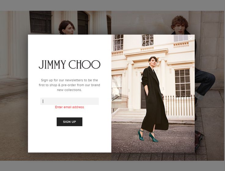
2. Jimmy Choo
While enticing email signups with discounts is common, it’s not an absolute requirement.
If offering year-round discounts doesn’t align with your brand’s strategy, take inspiration from Jimmy Choo’s approach.
The retailer offers an exclusive opportunity: pre-order the latest collection items by sharing your email address.
This approach not only builds a dedicated subscriber base but also fosters a sense of being “in the know.”
Here’s why Jimmy Choo makes it to the list of newsletter signup form examples:
- Clearly stated benefits
- It creates a sense of exclusivity
- Simplicity
 Source: Pinterest
3. SheSimplyShops
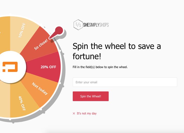
Modern signup forms frequently incorporate interactive features. An example of a business that embraces this tactic is SheSimplyShops, a small clothing brand.
The brand’s signup form presents visitors with a virtual wheel they can spin for a chance to win discounts. This engages users and incentivizes them to submit their email addresses.
Also notable is SheSimplyShops’ use of an “It’s not my day” option for closing the popup. This tactic leverages psychology to enhance conversions effectively.
Here’s a summary of why this specific email signup form works so effectively:
- Negative opt-out
- Engaging and interactive
- Compelling copy
 Source: Pinterest
4. Smart Passive Income
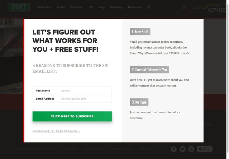
One of the most no-fluff popup examples is this one by Smart Passive Income (SPI). The popup form begins with text that helps the visitor feel less isolated in their money-making journey.
Next, it proceeds to outline the advantages of subscribing. Take note of its transparency; for instance, when discussing personalized content, it mentions that this will be a gradual process, not an immediate one.
The form also leverages social proof by mentioning “125,000 times” and offers a simple, direct opt-out CTA.
Here are aspects of the email signup form worth taking inspiration from:
- Its honesty and candidness
- Social proof
- Clear and simple opt-out option
 Source: Pinterest
5. Harvesto Farming
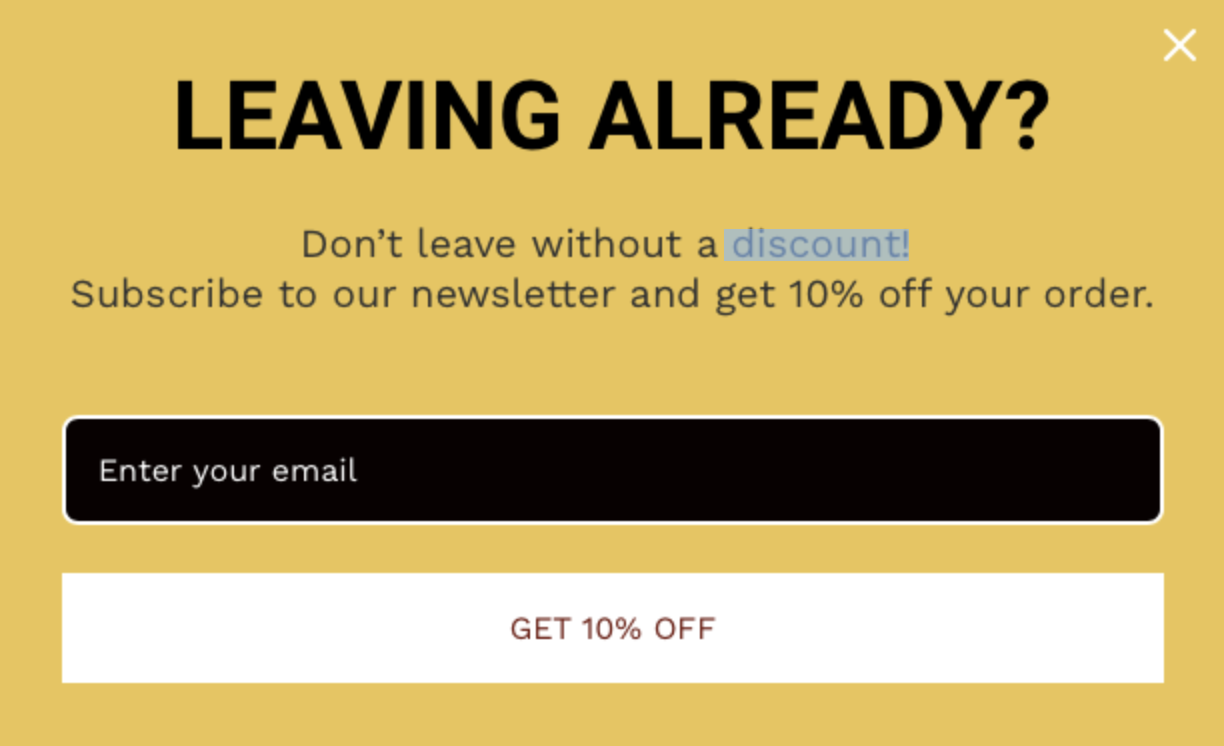
Our signup form examples list would be incomplete without one that integrates exit trigger actions.
The striking “LEAVING ALREADY?” effectively captures the visitor’s attention. Additionally, using contrasting colors such as yellow, black, and white ensures all form elements stand out.
Here’s a recap of what makes this email signup form so efficient:
- Eye-catching design
- Emotionally compelling text
- Transparent discount offer
 Source: Omnisend
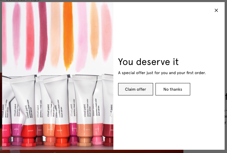
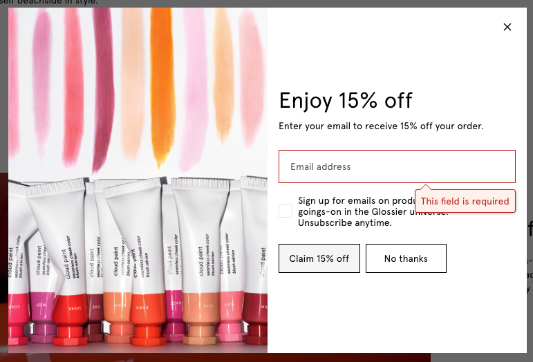
6. Glossier
Glossier uses one of the multi-step popups I mentioned before.
In the first step, the brand asks if you’re interested in the offer but doesn’t reveal what exactly.
In the second step, it offers 15% OFF.
Source: Glossier
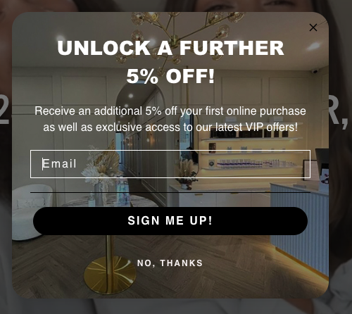
7. Cosmetic Boutique Australia
This brand goes straightforward. When you open the website, the signup form pops up immediately offering you a discount for the first order.
From my perspective it’s a bit too soon, but many brands do the same. It also might be an option for you to test it out.
Source: Cosmetics Boutique Australia
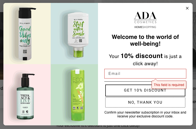
8. ADA Cosmetics
ADA Cosmetics has a big website with a lot of information about their products. But the popup shows up only when entering the online shop. As you can see, it also offers a discount for the first purchase as a nudge to shop and convert from the subscriber to the customer faster.
Source: ADA Cosmetics
9. Dollar Shave Club
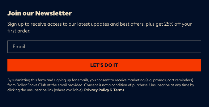
This well-known men grooming brand doesn’t have the popup on the store at the moment. But we like the form at the bottom of the page. This is a standard, built-in form with the generous offer to sign up. Take a look.
Source: Dollar Shave Club
Best practices for creating your own signup form
Creating a signup form is like inviting people to join your club. You want it to be easy and exciting. Here are some best practices to make sure your signup form is the best it can be:
1.Keep it simple and short
Nobody likes to fill out long forms. Keep your signup form short and ask only for the necessary information, like name and email. This way, more people will want to join because it’s quick and easy. You may also consider using multi-step signup forms that ask one question at the time, but in general, you can collect more information from your subscribers. For these, check Klaviyo or Omnisend.
2.Use proper field types
Make sure the form fields are clear and match what you’re asking for. For example, if you need a phone number, use a field for a number with pre-filled statecode. If you need an email, use an email field. This helps people know exactly what to do, making it less confusing and faster to fill out.
3.Provide real-time validation
Real-time validation means checking the information as people type it in. If they make a mistake, like typing an email wrong, a little message pops up right away to help them fix it. This makes sure everything is correct before they submit the form and avoids frustration later.
4.Clear call to action
A clear call to action (CTA) is a button that tells people what will happen next. Use bright colors and simple words like “Join Now” or “Sign Up!” This encourages people to click the button and complete the signup process.
5.Use social proof
Social proof is showing that other people have already joined and love it! You can add testimonials, reviews, or the number of people who have signed up. This makes new visitors feel more confident and excited to join because they see that others are happy too.
6.Make it visually appealing
Your signup form should look nice and match the style of your website. Use colors, fonts, and images that are fun and inviting. A beautiful form catches people’s eyes and makes them more likely to sign up.
You can find some help or inspiration in your email service provider’s library. Many email platforms offer ready-to-use signup forms. The only thing you need to do is to double check the copy. This is pretty helpful feature used by many marketers to save time and avoid mistakes.
Email tools providing signup forms for the best results
Crafting an appealing newsletter signup form is relatively uncomplicated. However, it can consume valuable time. Thankfully, free tools and software are here to simplify this process.
Whether you’re an entrepreneur or a marketer, these five tools can help you grow your email list and drive your business forward.
1. Privy

Source: Privy
One of Privy’s standout features is its list-building capabilities. Let’s explore why.
Form types:
- Bars and banners
- Exit-intent popups
- Spin-to-win popups
- Flyouts
- Embedded forms
- Tabs
Pros:
- Privy turns top-performing popups into templates
- Display types for many occasions
- Modern and attractive designs
- Gamification elements
- Advanced email signup form analytics
Cons:
- Lacks the feature for creating multi-step signup forms
Pricing:
Free plan inclusions: Users on the free plan can enjoy all popup types and advanced popup targeting features.
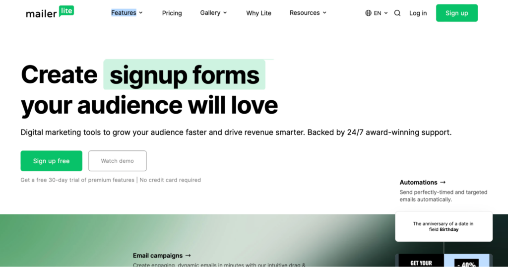
2. MailerLite
Source: MailerLite
MailerLite, a renowned email marketing tool, offers attractive templates, including signup forms.
Form types:
- Signup popups
- Promotion popups
- Slide-in popups
- Embedded forms
- Half-screen forms
- Narrow bars
Pros:
- Forms for every occasion
- Large gallery of templates
- Signup form reporting dashboard
- Easy to create good-looking forms quickly
Cons:
- No gamification features
- Promotional popups are only available on the most expensive plan
Pricing:
Free plan inclusions: MailerLite’s free plan includes most list-building features except promotional popups.
3. Omnisend

Source: Omnisend
Omnisend is yet another tool that boasts strong list-building capabilities.
Form types:
- Multi-step forms
- Popup forms
- Teasers
- Wheel of fortune
- Embedded forms
Pros:
- An extended collection of good-looking, ready-to-use templates
- Extremely easy to create and publish
- Strong gamification capabilities
- Designed to look good on any device
Cons:
- Signup forms on the free plan come with the Omnisend logo.
Pricing:
Free plan inclusions: Users of the free plan can access all the signup form features available in the paid plans. The only difference is that the forms include a “Powered by Omnisend” badge.
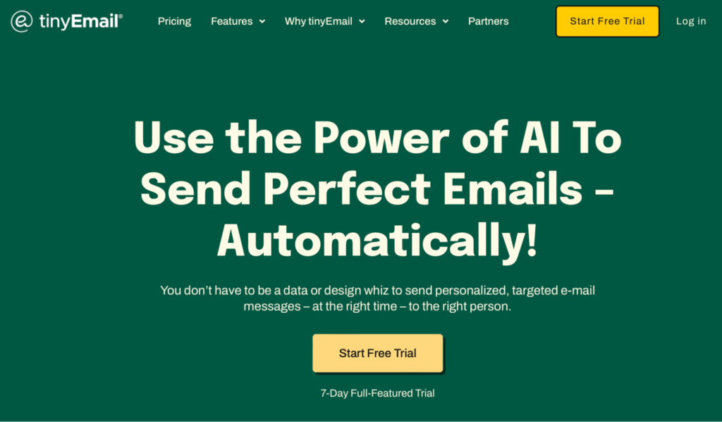
4. tinyEmail
Source: tinyEmail
While somewhat limited to most other tools in this list, tinyEmail is an option worth exploring.
Form types:
- Popup forms
- Embedded forms
- Flyout forms
Pros:
- Easy and quick implementation
- Library with form templates
Cons:
- Several form types aren’t available
- No analytics for signup forms
- Forms aren’t so easy to edit
Pricing:
Free plan inclusions: The signup form features are consistent for both paid and free plan users.
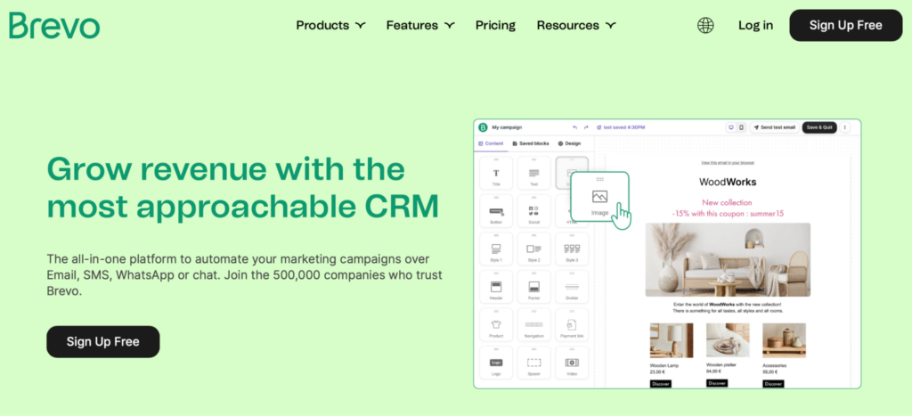
5. Brevo
Source: Brevo
Concluding our list of newsletter signup form tools is Brevo. Now, let’s explore what it brings to the table.
Form types:
- Popup forms
Pros:
- Multi-list subscriptions
- The choice to integrate CAPTCHA into your forms
Cons:
- Just one basic popup form
- No library of templates to choose from
- Analytics are missing
Pricing:
Free plan inclusions: Brevo offers customizable signup forms on its free as well as paid plans.
Wrap up
Signup forms play a key role in the expansion of your email list. This is the first step to reaching a broader audience.
With the right tools and creative approaches, you can make the process both efficient and cost-effective. From good-looking templates to gamification elements, the tools in this article offer many features to suit your unique needs.
However, remember that list growth is a continuous journey, demanding constant adaptation—the incentives you offer, whether discounts or exclusive access, will evolve.
Hopefully, the newsletter signup form examples in this article will be a source of inspiration for your list-building campaigns.
